Skip straight to list of what’s on this page
Pensions dashboards in Europe
Several countries in continental Europe have developed, or are developing, pensions dashboards.
What we in the UK call pensions dashboards, other countries call Pension Tracking Systems (or PTSs), which is actually a much more accurate name.
In November 2021, the European Insurance and Occupational Pensions Authority (EIOPA) published a detailed report on best practice for developing PTSs, including this very helpful map:
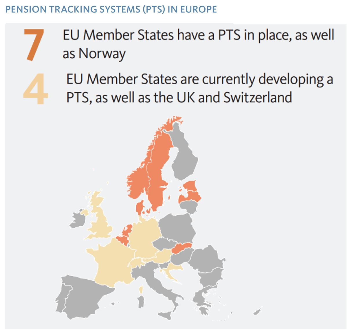
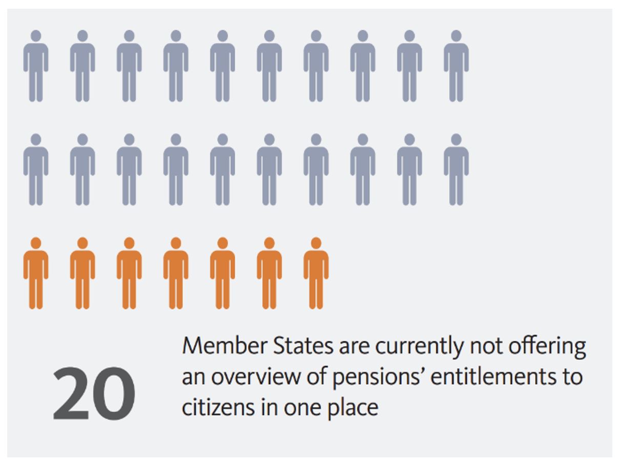
(EIOPA’s report was aimed at helping those countries without pensions dashboards to develop them.)
BLANK
Research in June 2023 – Pensions REDUX tour
5 of the 8 “orange” countries on EIOPA’s map have operated pensions dashboards for well over a decade.
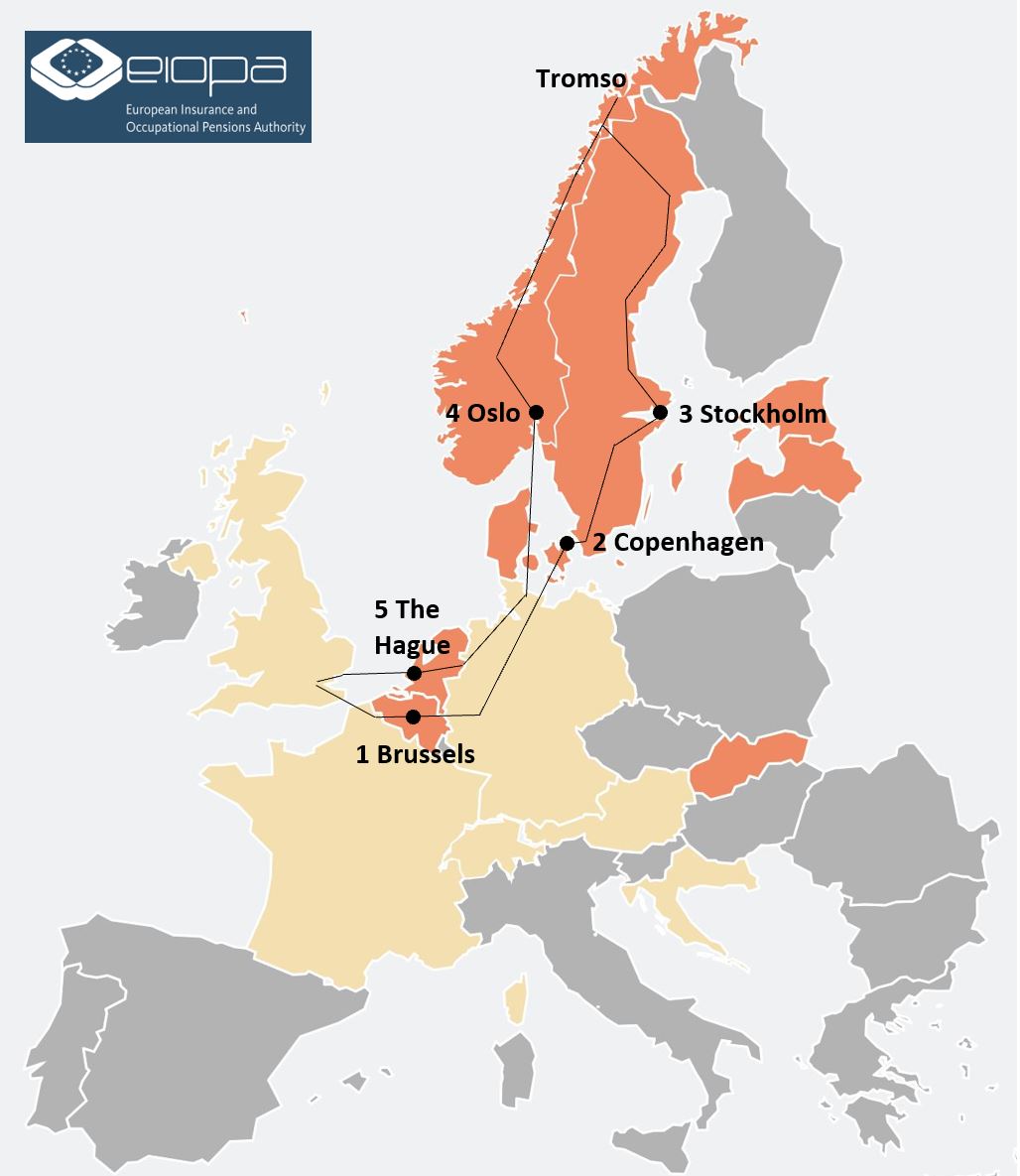
In June 2023, I had the absolute privilege of visiting the five teams who operate these dashboards to learn more about the user eXperiences (UXs) which their pensions dashboards offer to citizens in their countries. I also wanted to hear how these UXs have been iterated and enhanced over time.
I visited the five country dashboard teams in the order shown below:
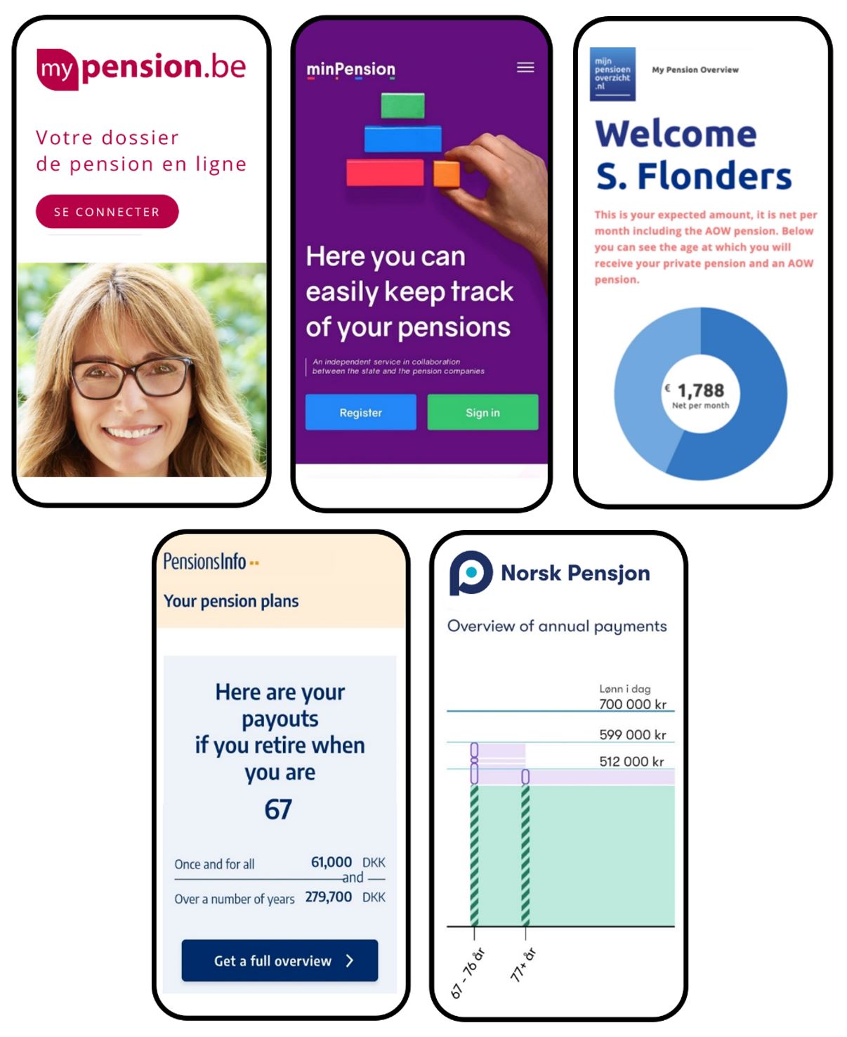
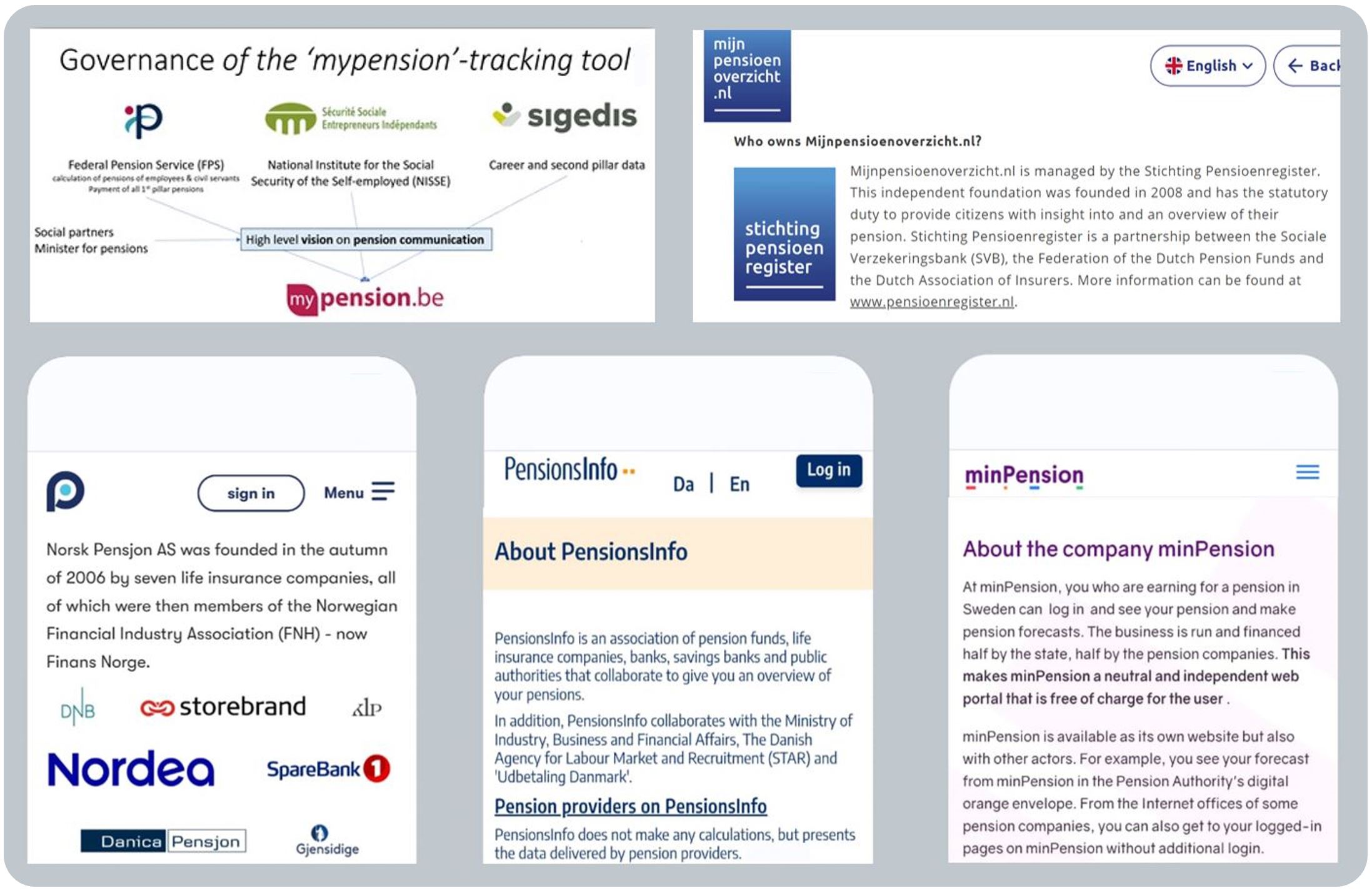
- Belgium: mypension.be
- Denmark: PensionsInfo.dk
- Sweden: minPension.se
- Norway: NorskPensjon.no
- Netherlands: Mijnpensioenoverzicht.nl
Read on for key country findings from my research tour.
But first, I’ve summarised 10 snippets insights and also 10 general comments on the key themes I observed and what these learnings might mean for us in the UK.
BLANK
What’s on this page?
Background to the research tour
BLANK
10 snippet insights
BLANK
General Comments:
1. Consuming this research
2. Segmenting users into types
3. Recognising country differences
4. Optimising for different devices
5. Verifying digital identities
6. Matching people to pensions
7. Impartially displaying pensions
8. Making data available to apps
9. Understanding what users feel and do afterwards
10. Launching, and continually improving, dashboards
Links to country pages of detailed UX research findings:
Belgium
Denmark
Netherlands
Norway
Sweden
Other European countries with dashboards
BLANK
Background to the research tour
What’s happening in the UK?: The UK is currently developing pensions dashboards, with the policy development dating back to 2014, and even as far back as 2002 (as recorded on this independent blog).
What’s happening on the Continent?: Some of our continental European neighbours have been operating dashboards for years (and others are developing them) – so it makes sense to hear their learnings.
Previous engagement: The UK Department for Work and Pensions (DWP), the UK Pensions Dashboards Programme (PDP), and others, have engaged with the continental teams on several previous occasions.
But, to date, the UK hasn’t had a really detailed look at the user experiences (UXs) offered by the continental dashboards, and the reasons countries have developed the user interfaces (UIs) they have.
Why now?: As the UK Government’s MoneyHelper dashboard, and commercial pensions dashboards, are about to start being tested and iterated, now is a good time to learn more about the continental UXs / UIs.
Research tour: In June 2023, as an independent pensions dashboards consultant (i.e. not sponsored by any organisation), I was privileged to visit:
- Brussels: Giselda Curvers, Myriam Lanotte and Steven Janssen who operate mypension.be
- Copenhagen: Michael Rasch who leads the team which operates PensionsInfo.dk
- Stockholm: Anders Lundström and team who operate minPension.se
- Tromsø*
- Oslo: Trond Tørstad and team who operate NorskPensjon.no
- The Hague: Stefan Taubert and team who operate Mijnpensioenoverzicht.nl
I called the trip the Pensions REDUX tour, i.e. Research into European Dashboards’ User eXperiences**.
Research findings: For each of the five countries I visited there is a country page on this blog summarising key findings from that country. And below, a suite of 10 snippet insights and also 10 key general comments.
The focus of the research tour was the dashboards’ UXs and UIs, but some wider findings are also included.
Huge thanks: The continental teams were all extremely generous in demonstrating their dashboards, explaining the thinking behind their UI designs, and discussing what works best for users of different types.
I am very grateful indeed for all the teams’ generosity with their time and insights and their genuine desire to try and help us in the UK make our pensions dashboards as good as they can be for UK citizens.
Next steps: Whilst every country is different, I hope that bringing back these learnings to the UK, and summarising them on this blog, will help designers of UK pensions dashboards (both Government and commercial), and in turn help great dashboards to be launched in the UK as soon as possible. Many thanks.
BLANK
* Having given up flying in 2018, and driving in 2021, the research trip travel was all by rail and ferry – great fun! Between my visits to Stockholm and Oslo, I caught the sleeper train north to watch my daughter run Tromsø’s Midnight Sun Marathon where, during June, the sun never sets, and the day never ends.
** REDUX was an appropriate name for the trip for two reasons: in Latin, redux means “to bring back”, and in technology, Redux is a tool for managing the state (or data status) of browser applications.
BLANK
BLANK
Snippet #1 Commercial dashboards are popular (NO)
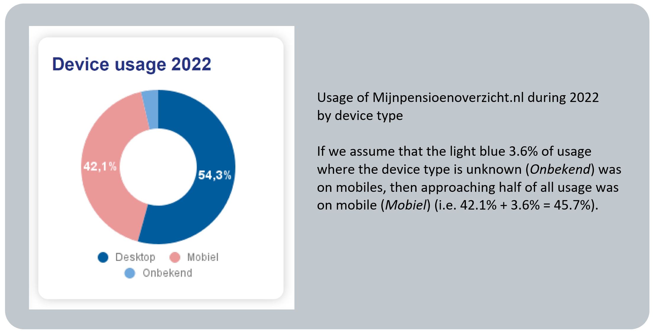
Snippet #2 Mobile usage is high (NL)
Snippet #3 Usage builds over time (DK)
Snippet #4 Usage increases with age (BE)
Snippet #5 Segmenting users informs better UXs (SE)
Snippet #6 Total monthly income (TMI) is key (NL)
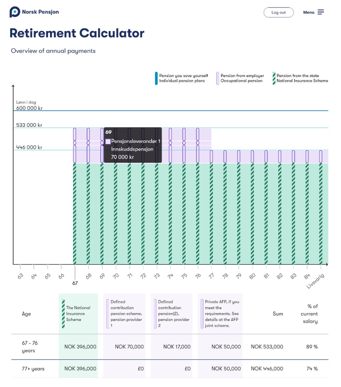
Snippet #7 Timelines and tables aid understanding (NO)
Snippet #8 Modelling different ages is popular (DK)
Snippet #9 Simple ESG info is wanted next (SE)
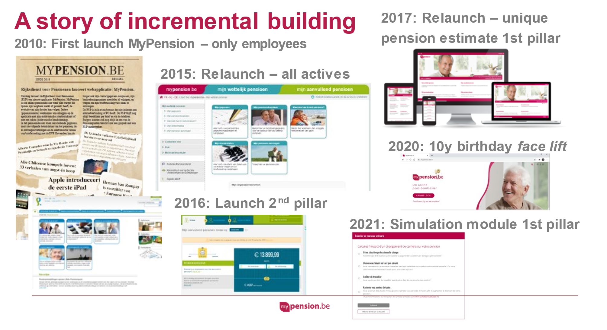
Snippet #10 Great dashboards take time, but you have to make a start (BE)
BLANK
BLANK
Pensions REDUX snippet insight #1 of 10: Commercial dashboards are popular
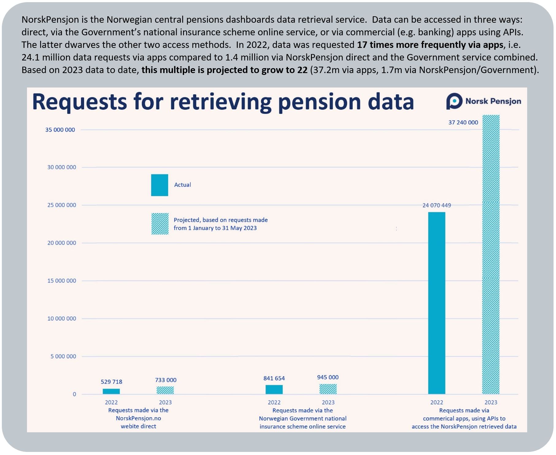
In Norway, in 2022, data requests to retrieve and view all your pensions data together were made via commercial apps 30 times as often as via the Government or direct access routes
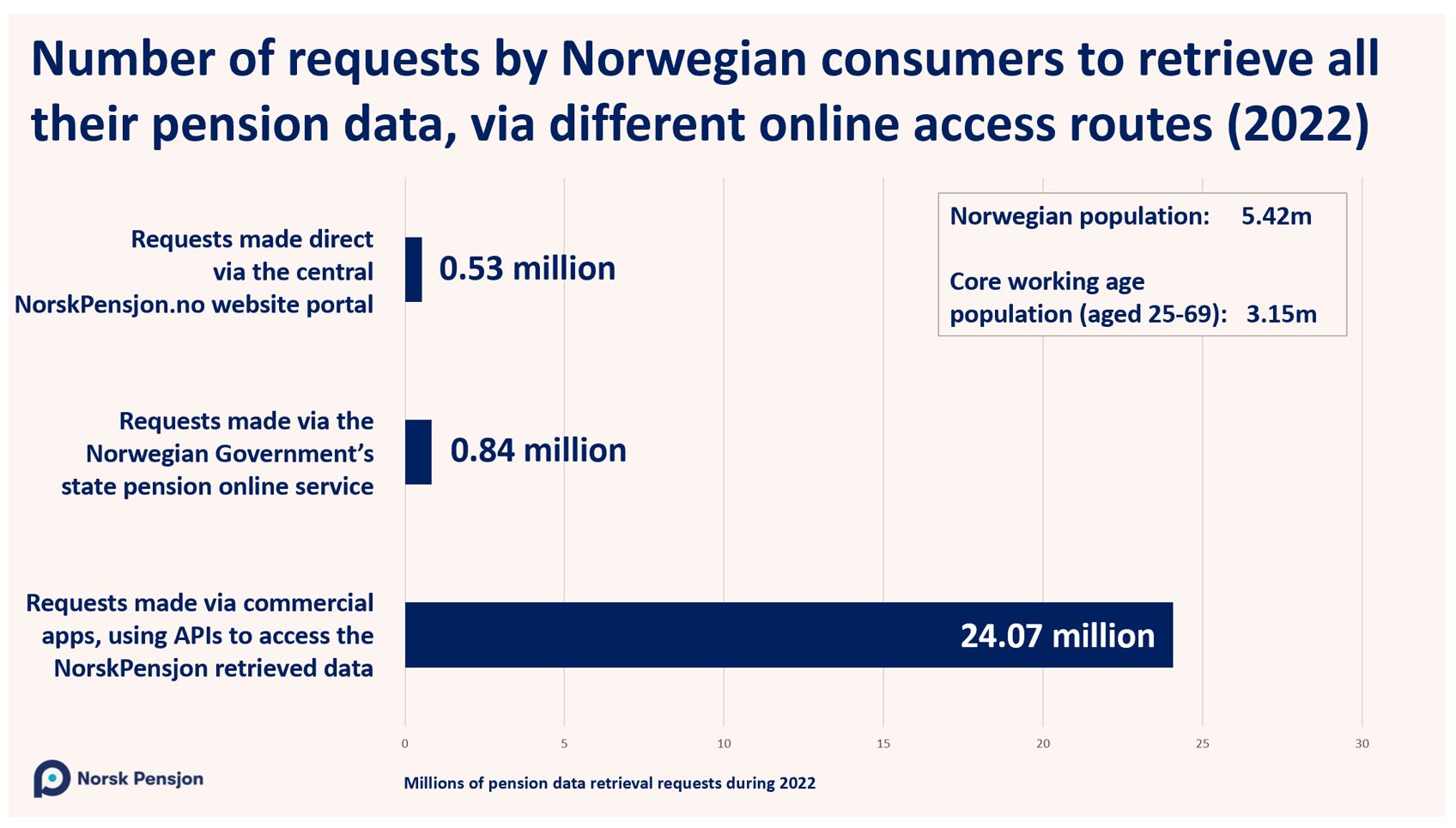
This snippet insight was posted on LinkedIn on 2 October 2023 – see the LinkedIn post here.
I’ve kept in touch with the Norway team, who sent me, in January 2024, their usage data for 2023:
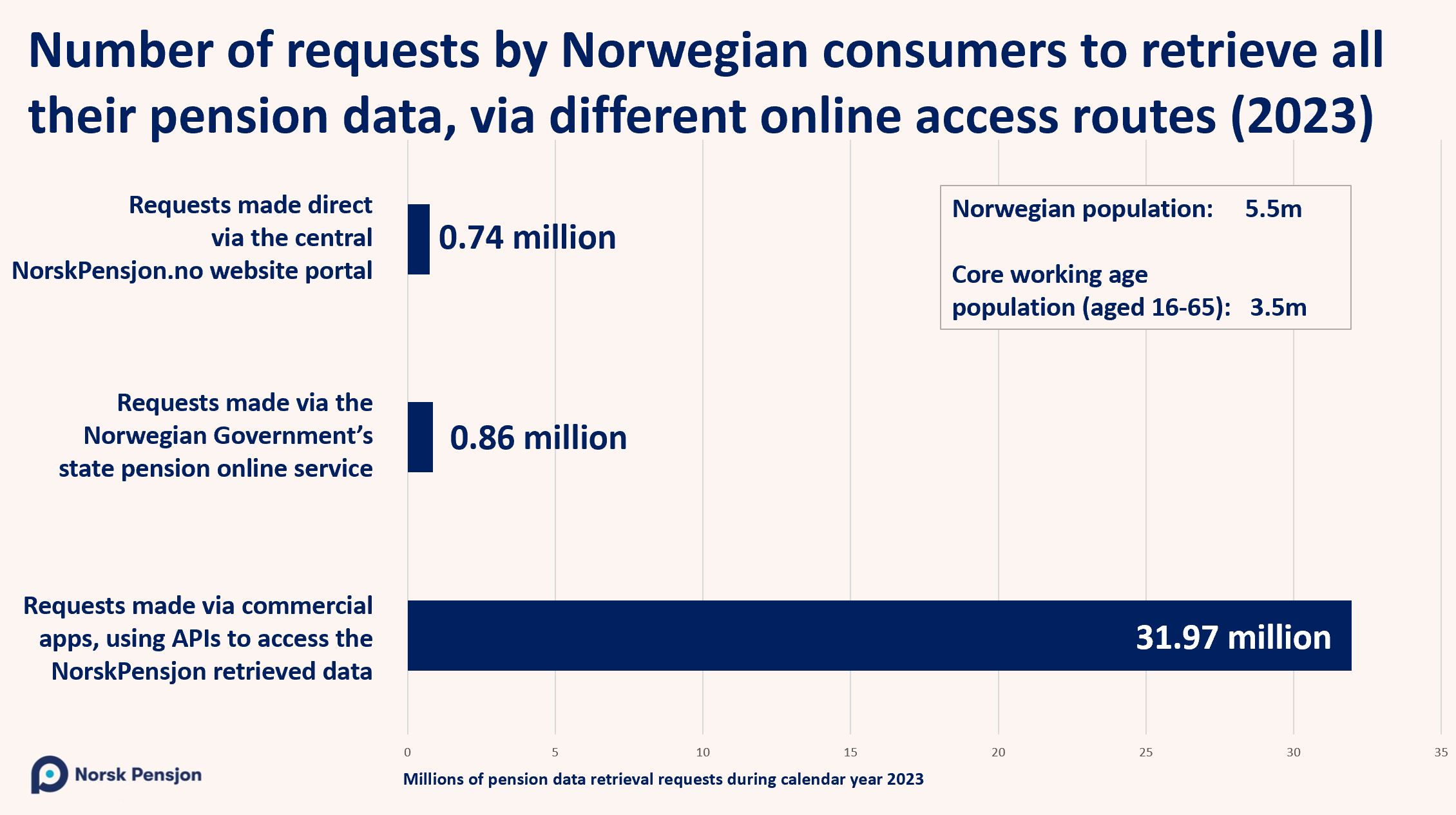
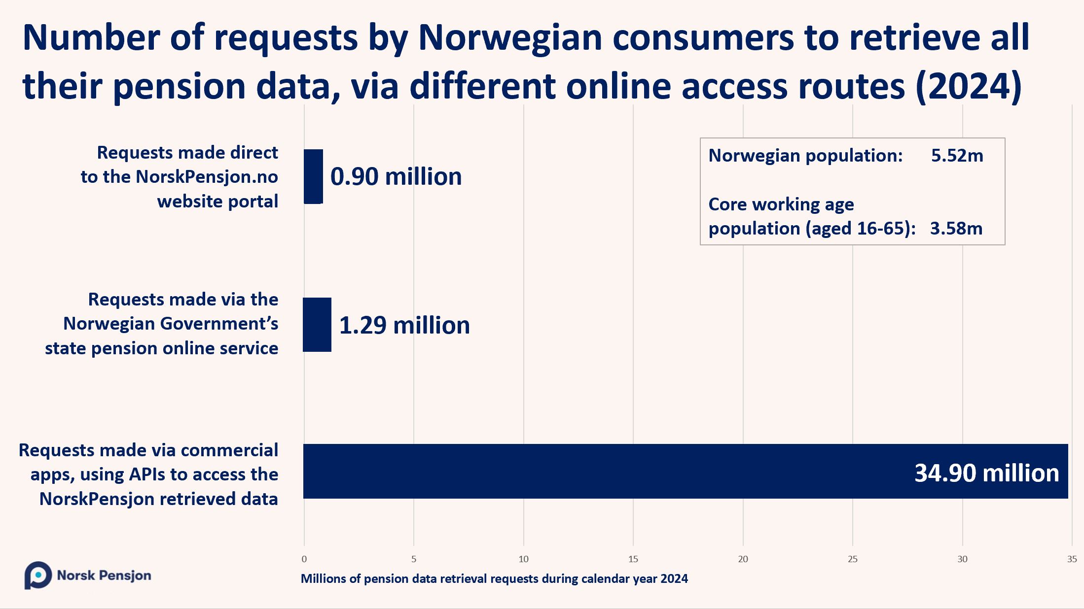
and, in January 2025, their data for 2024:
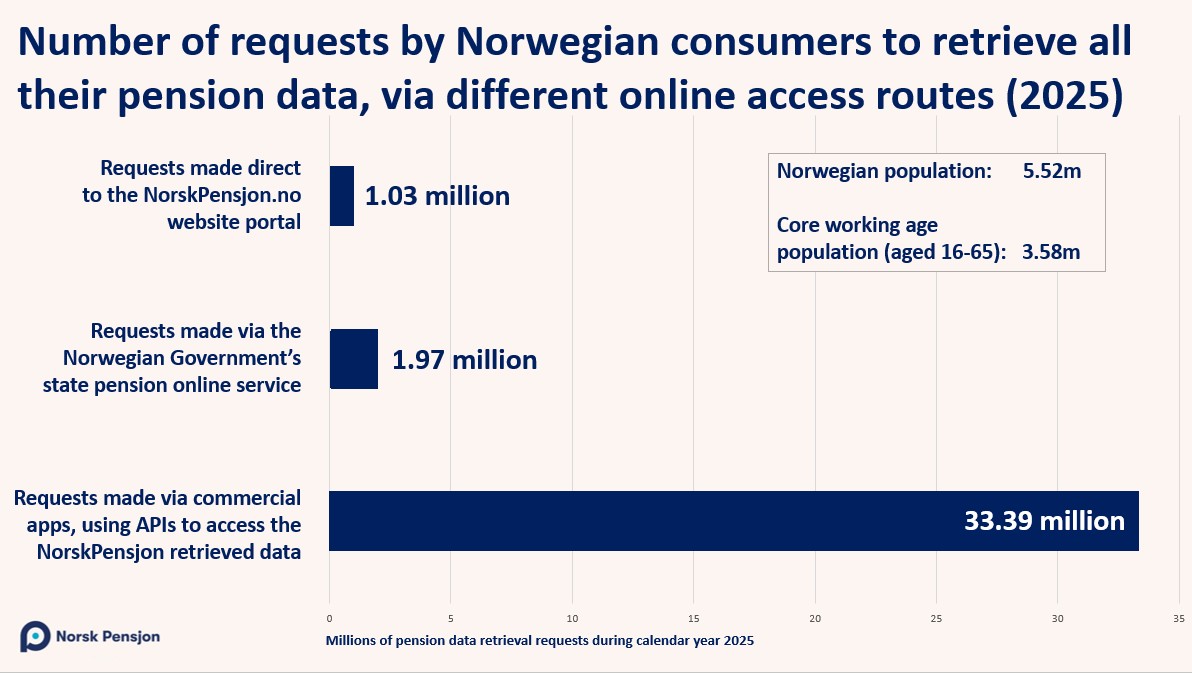
and, in January 2026, their data for 2025:
BLANK
Pensions REDUX snippet insight #2 of 10: Mobile usage is high
In 2022, nearly half (at least 42%) of all visits to the Dutch pensions dashboard website (Mijnpensioenoverzicht.nl) were made through mobile devices (Onbekend = Unknown)
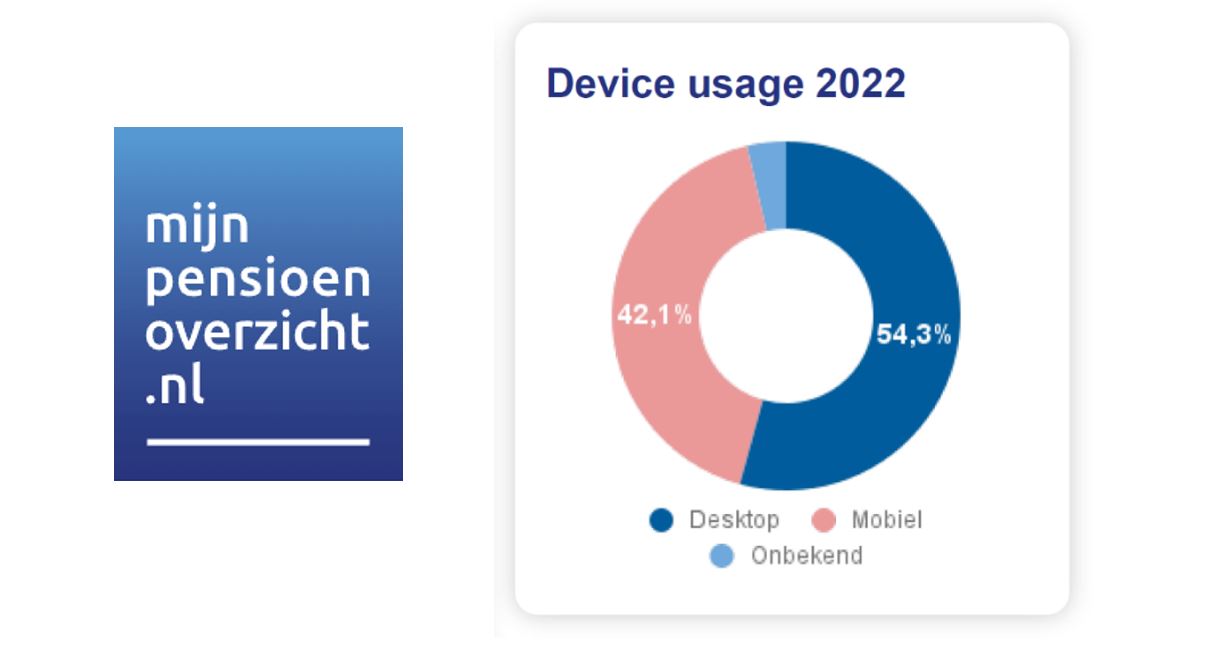
This snippet insight was posted on LinkedIn on 3 October 2023 – see the LinkedIn post here.
BLANK
Pensions REDUX snippet insight #3 of 10: Usage builds over time
Over the last 15 years, logons to the Danish pensions dashboard (PensionsInfo.dk) have grown steadily.
Today, a remarkably consistent c.37% of working age adults now use pensions dashboards in BE, DK, NL and SE (and it could be higher in NO as commercial apps can also show you all your pensions in Norway)
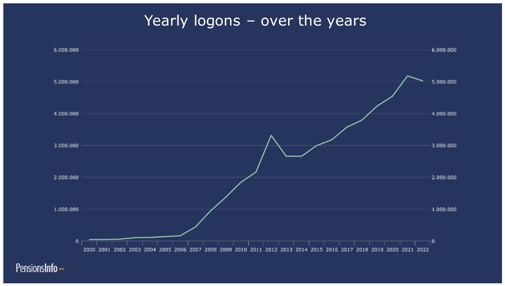
This snippet insight was posted on LinkedIn on 4 October 2023 – see the LinkedIn post here.
BLANK
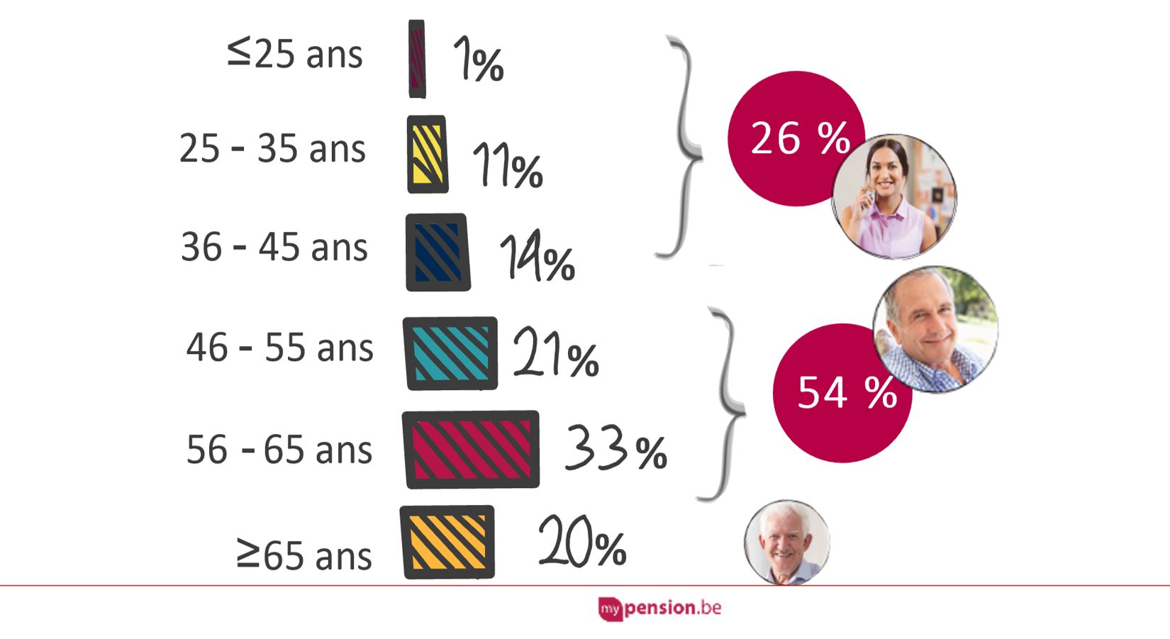
Pensions REDUX snippet insight #4 of 10: Usage increases with age
In 2022, 54% of users of the Belgian pensions dashboard (mypension.be) were aged 46-65.
As a rough rule of thumb, and pretty consistently across countries, mature dashboards are used by about:
20% of all of a country’s 20-somethings
30% of all 30-somethings
40% of all 40-somethings and
up to 60% of all 50- and 60-somethings
This snippet insight was posted on LinkedIn on 5 October 2023 – see the LinkedIn post here.
BLANK
Pensions REDUX snippet insight #5 of 10: Segmenting users informs better UXs
In 2015, the UX of the Swedish dashboard (minPension.se) was completely redesigned to better meet the needs of all segments of the Swedish adult population (not just the <20% interested in pensions)
This snippet insight was posted on LinkedIn on 6 October 2023 – see the LinkedIn post here.
BLANK
Pensions REDUX snippet insight #6 of 10: Total monthly income (TMI) is key
The main thing most users of dashboards most want to know is what Total Monthly Income (TMI) they might get when they retire (ideally net of tax), which is why the Dutch dashboard shows it right on the Welcome page
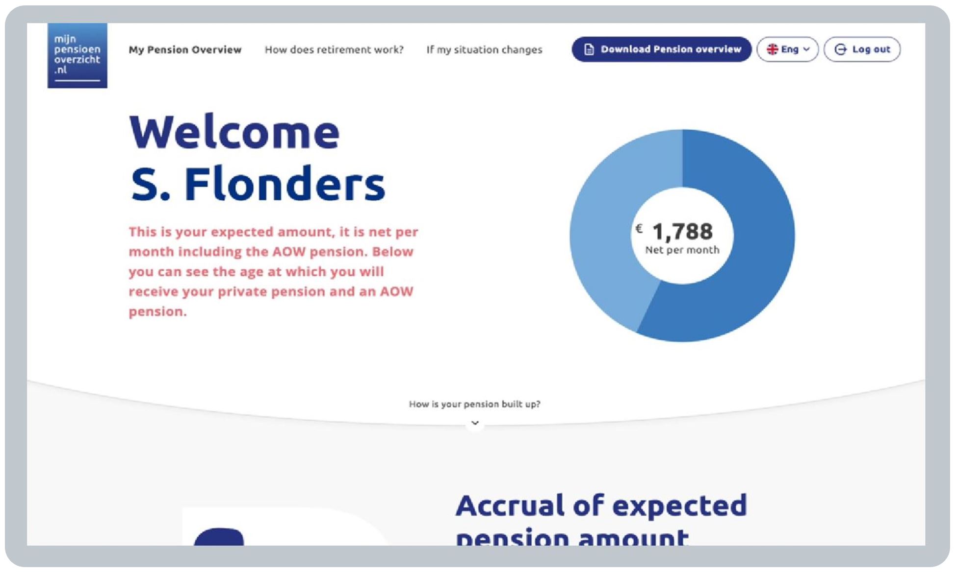
This snippet insight was posted on LinkedIn on 9 October 2023 – see the LinkedIn post here.
BLANK
Pensions REDUX snippet insight #7 of 10: Timelines and tables aid understanding
The pensions dashboards in NO, SE and DK show pension figures as a timeline graphic to help users comprehend the recurring nature of pension incomes over time (with a table too for users preferring that)
This snippet insight was posted on LinkedIn on 10 October 2023 – see the LinkedIn post here.
BLANK
Pensions REDUX snippet insight #8 of 10: Modelling different ages is popular
Moving a slider on the Danish pensions dashboard helps users understand what total pension income they might get if they retire at any age from 61 to 70 – in the UK, a Post View Service could similarly help users
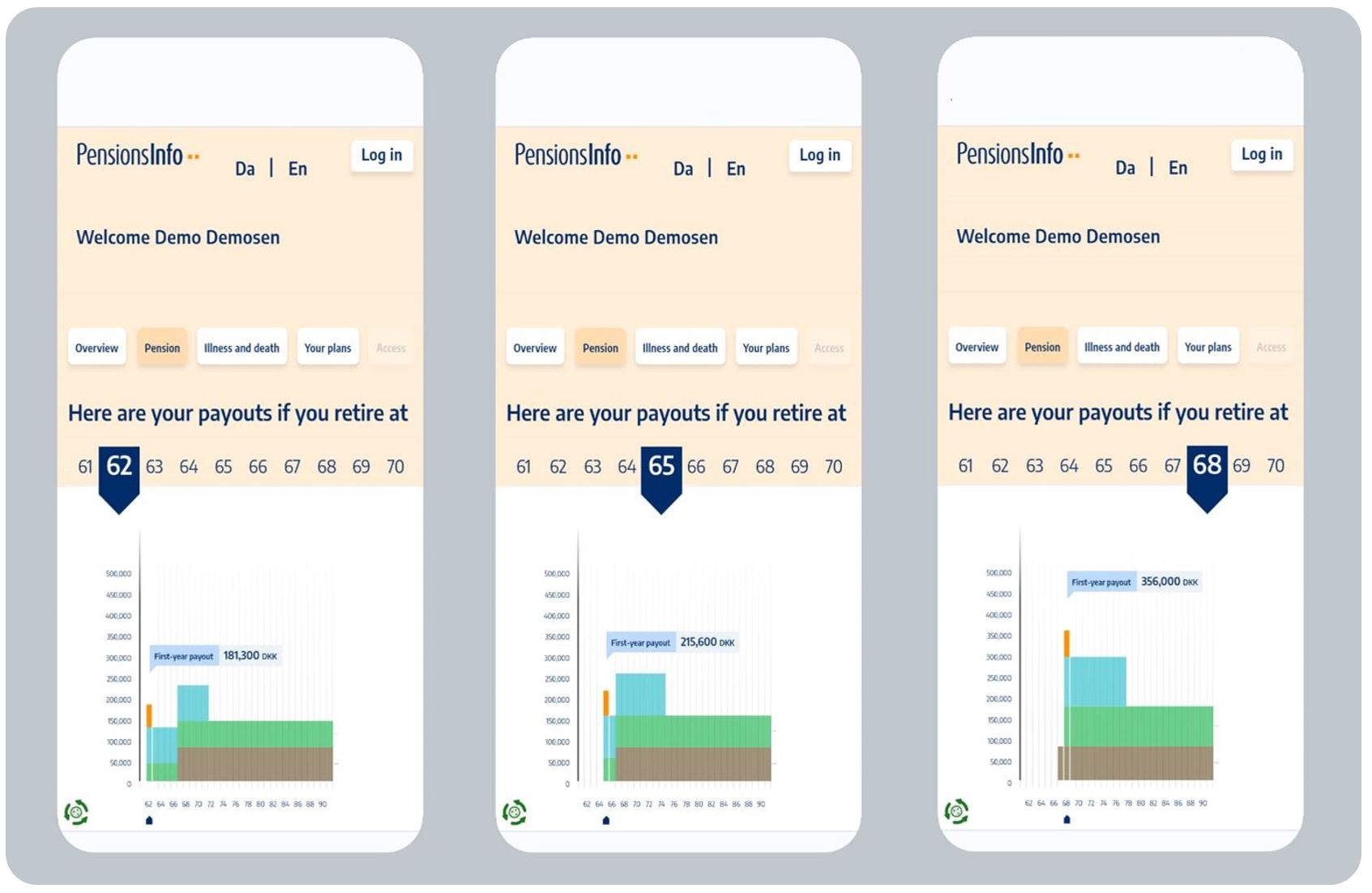
This snippet insight was posted on LinkedIn on 11 October 2023 – see the LinkedIn post here.
BLANK
Pensions REDUX snippet insight #9 of 10: Simple ESG info is wanted next
Richard: “Anders, what new features do Swedish pensions dashboard users ask for most?”
Anders: “They want to see ESG information about their pensions, as I said back in 2022.”
Visiting Standard Life in London in 2022, Anders had said: “[In response to demand] we are undertaking a study to include more ESG information on the Swedish dashboard. But conceptions of ESG are changing and we know from user testing most users will only spend up to 3 minutes assimilating ESG information”
Read about Anders’ 2022 trip to Standard Life here: https://www.standardlife.co.uk/about/thinking-forward/articles/article-page/pension-dashboards-your-questions-answered

This snippet insight was posted on LinkedIn on 12 October 2023 – see the LinkedIn post here.
BLANK
Pensions REDUX snippet insight #10 of 10: Great dashboards take time, but you have to make a start
All the dashboards, in all five countries I visited in June, have been enhanced over time (such as the 5 iterations of the Belgian dashboard since 2010 shown here)
Crucially, enhancements can be made in response to real feedback from real users of different types about what helps them most
But actually launching dashboards is most important as only then can iterative improvements start and continue
So the key message I learned from the continental dashboards teams was:
Great pensions dashboards are achieved by making many improvements, over many years, and those improvements never stop; but to start making those improvements, you must launch v1
Let’s get initial version 1 UK dashboards launched asap!
This snippet insight was posted on LinkedIn on 13 October 2023 – see the LinkedIn post here.
BLANK
General Comment 1 – Consuming this research
(snippets, style, supplementaries & summary)
Snippets: Just like dashboards themselves, the output from this research needs to be easily consumable. Otherwise, what’s the point?
My primary hope is that pensions industry folk in the UK will want to read and digest these findings.
If enough of us reflect on why other countries’ dashboard UXs are as they are, then hopefully initial dashboards in the UK can be launched both better, and sooner, than would otherwise have been the case.
So I’ve tried to avoid long paragraphs of dense text: research write ups like that can too often go unread.
Instead, I’ve tried to be snippety, using as few words as possible, with plenty of screenshots and graphics.
Style: Whilst pensions is a serious subject, I’ve also tried to make you want to keep reading by using a language style which is accessible, and even (at times) a little bit fun!
Supplementaries: The continental dashboards teams were all extremely generous, sharing loads of screenshots, video recordings, statistics and other insights with me.
I’ve chosen which findings to include and omit on this blog (aligned with General Comments 2-10 below).
If you have a supplementary question, please do get in touch with me via the details on my Contact page: it’s possible I’ve got the answer but chose not to include that level of detail in this snippet-based write up.
Summary: For folk with no time to read any further, what’s the key learning from the trip as a whole?
Great pensions dashboards are achieved by making many improvements, over many years, and those improvements never stop; but to start making those improvements, you first have to launch version 1.
Also, if you’re pushed for time, see the 10 snippet insights for some key bite-sized learnings.
And finally, here’s a 3-minute highlights video of the research trip you might like to watch:
BLANK
BLANK
General Comment 2 – Segmenting users into types
Diverse users
Any working age population is diverse, making people’s various needs of pensions dashboards diverse too.
There are lots of ways you could break down a population into numerous different segments, but, at a very high level, the dashboard teams in all the countries I visited talked about two core types of dashboard user:
- Type A: generally interested in summary info, often with a primary focus solely on TMI*
- Type B: interested in understanding more than just their Type A information, what it might mean for them, and how it might change if they were to retire at different ages or make other changes.
* TMI often means “too much information” but I use it to mean “total monthly income”, that is, the total income a pensions dashboard user might get every month during retirement, ideally net of income tax (as that’s relatable to their take-home pay today).
Different features for different users
So, in very simple terms, the dashboards I saw have generally been designed to show basic information for Type A users, with more detailed and sophisticated information and tools if Type B users want to use them.
Relative sizes of different segments
It’s difficult to define in precise terms the relative sizes of the Type A and Type B user segments, although an approximation can be made from the usage statistics of each dashboard’s features which are “Type B”.
When I asked each team to make a rough estimate, all the countries said remarkably consistent figures:
- Type A (“generally only interested in a summary”) are the overwhelming majority
- Type B (“interested in more detailed information and more sophisticated dashboard features”) were estimated by the teams to be in the region of about 10% of each country’s dashboard users (some countries said less than 10%, some slightly more, but it was never more than 20% of users).
Type B users are more extensive users of dashboards – they use dashboards more often, and they use them for longer periods of time – but there are very many fewer of them than Type A users.
Of course, Type A and B users can be fluid. For example, if a Type A user grows in confidence about their pensions and becomes more interested, they could become a Type B user. It’s just a rough labelling.
You could say one purpose of dashboards is to help grow Type A users’ confidence to become more B-like. All the countries said, despite being in the minority, the proportion of Type B users is growing, gradually.
Who are Type B users?
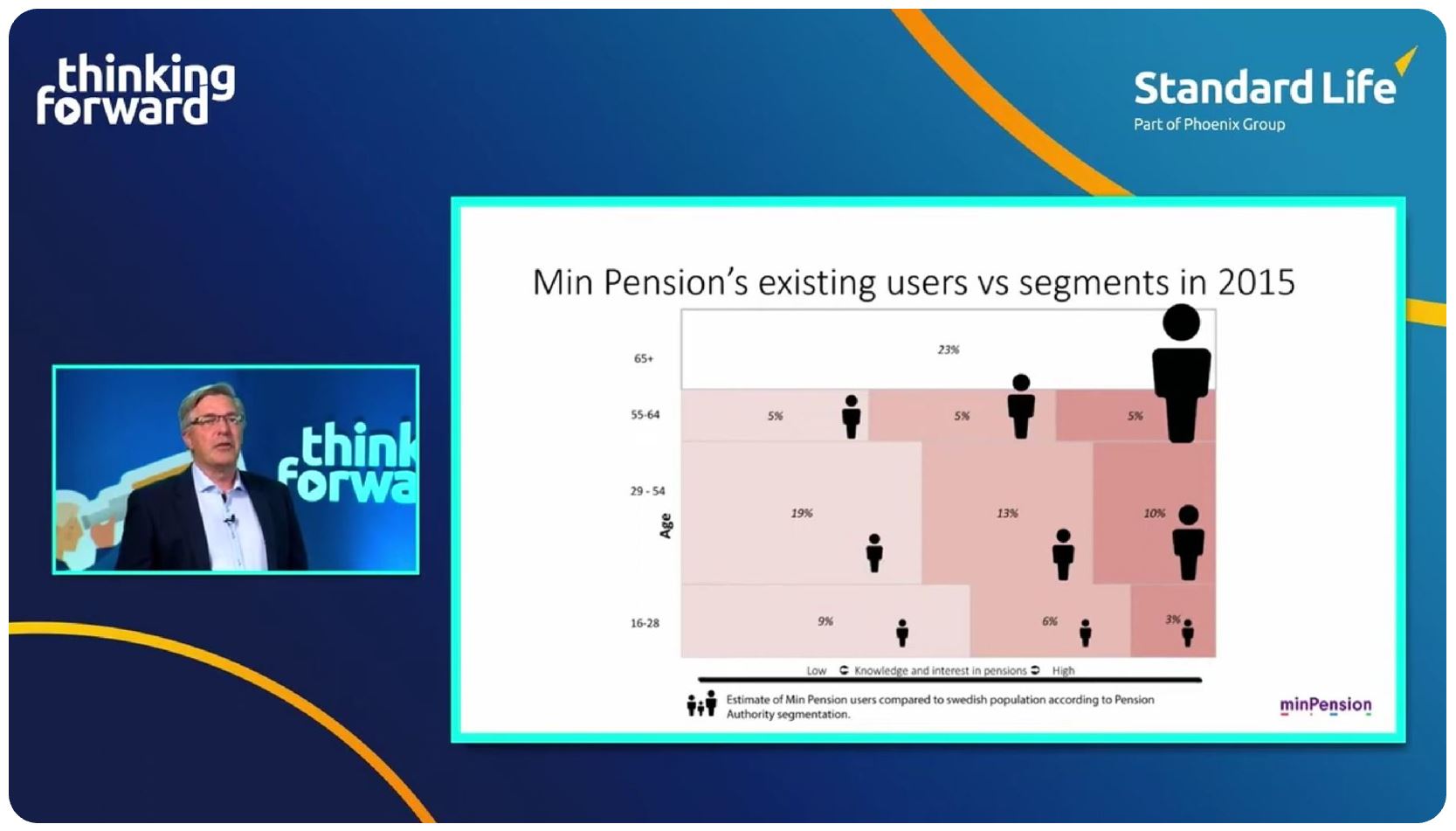
Generally, Type B users are older, i.e. later in their working lives. The Swedish dashboard team did some analysis in 2015 (see segmentation chart below) which found Type B users are also more likely to:
- be male than female
- have higher than average earnings and thus higher than average pensions
- have a greater than average levels of knowledge and interest in pensions, and
- be the keenest dashboard users initially.
Anders Lundström, Chief Executive of minPension, explained at a Standard Life Thinking Forward webinar in April 2022 how they segmented the Swedish population to help redesign the different UXs of their dashboard for different types of user.
Ignoring people aged 65+ (who are more likely to be retired), Type B users generally inhabit the top right 5% segment of the Swedish 3×3 “nine segment” segmentation model. They were also the keenest minPension users initially (represented by the size of the stickmen). The other eight segments, making up well over 90% of the Swedish working age population, are more generally Type A people.
The Belgian dashboard team have also spent time thinking about the different needs of different users and have devised four personas to help make the Belgian dashboard feel more relevant to users of different ages: see UX before using mypension for details.
Making dashboards relevant for all user segments
If UK dashboards are to be useful for as many people as possible, across a variety of diverse user segments, then dashboards need to cater for Type A users primarily.
To be useful to the 80-90% of the working age population (who are likely to be Type A users), their core basic need of seeing summary pensions information must be met primarily.
Additional, more sophisticated, features, which will be of interest to Type B users, also need to be developed and tested, but maybe this isn’t the highest priority for the initial launch of UK dashboards?
See General Comment 10 below on the importance of managing the expectations of Type B users when dashboards are first launched, especially if their more sophisticated needs are not going to be met initially.
BLANK
BLANK
General Comment 3 – Recognising country differences
Every country is different
It’s only possible to go so far with meaningful comparisons of different countries’ pensions dashboards.
At some point in each country’s dashboard user journey (usually quite early in the journey), the dashboard necessarily becomes specific to that country’s underlying pensions policies and structures. Makes sense.
Each country has also taken a slightly different approach in terms of how it has implemented its pensions dashboard, and there are country-specific practical challenges which have had to be overcome too.
There’s not a lot of point covering these country-specific issues here – they won’t be relevant to the UK, and, conversely, the UK will have its own challenges which won’t have been experienced in other countries.
But some things are the same
However, we can learn a lot from the high-level aspects of the consumer dashboard journeys which are pretty consistent across the different countries.
So, on this blog, I’ve focused on capturing consistent, high-level findings which will be most relevant and helpful for us in the UK, as we develop, test, launch and iterate our pensions dashboards.
As mentioned in General Comment 1 above, I do have more detailed country-specific findings which I’ve chosen not to write up here, so if you have a specific question, let me know as I may have the answer.
Core consistent message
One consistent message, first mentioned to me in Brussels (and reflected in my LinkedIn post after that visit), but also echoed by all five of the country teams, is that it’s important to get dashboards done as it’s just the right thing to do for consumers.
Also see General Comment 10 below on the importance of launching early.

The mypension.be team I met in Brussels.
BLANK
BLANK
General Comment 4 – Optimising for different devices
A time before ubiquitous mobiles
Which devices do people use to access pensions dashboards, and why? History’s really important here.
Today, approaching the mid-2020s, mobile phones are ubiquitous. Get on a train or bus, for example, and see how virtually everyone is on their phone. But we’ve only got to this position over the last decade or so.
Worldwide sales of smartphones only overtook sales of personal computers from around 2011 onwards.
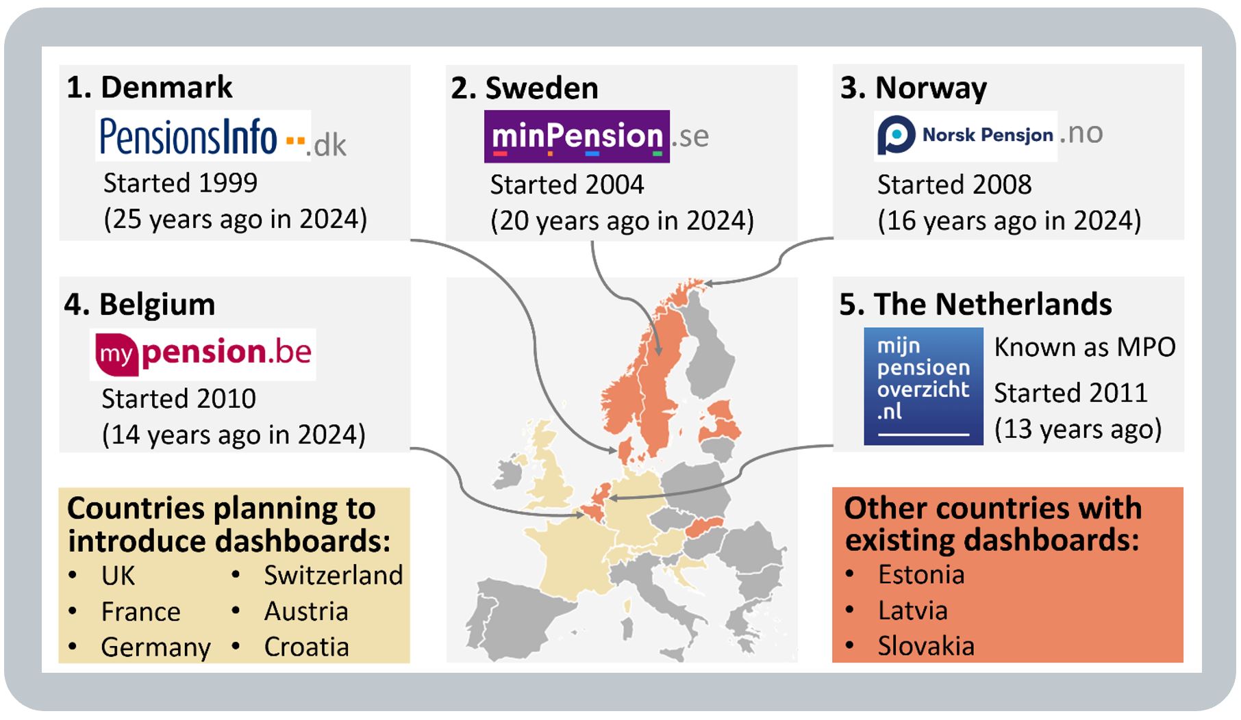
The design and launch of the dashboards in the five countries I visited all pre-date this (Denmark: launched 1999, Sweden: 2004, Norway: 2008, Belgium: 2010, Netherlands: 2011).
So these dashboards were all developed when most users were using desktop browsers to get online.
Mobile access today
But, of course, users in these countries now have mobile phones too, just like we all do, so they do access these (originally designed for desktop browser) dashboard websites on their phones.
For example, in 2022, nearly half (c.46%) of the usage of the Dutch dashboard was on mobile devices:
Optimising for mobile
Even though many users access the continental dashboards on their phones, as explained above, these dashboards were not originally designed primarily with mobile device displays in mind.
However, some of the dashboards are moving in that direction over time, by redesigning some or all elements of their dashboards to support mobile usage.
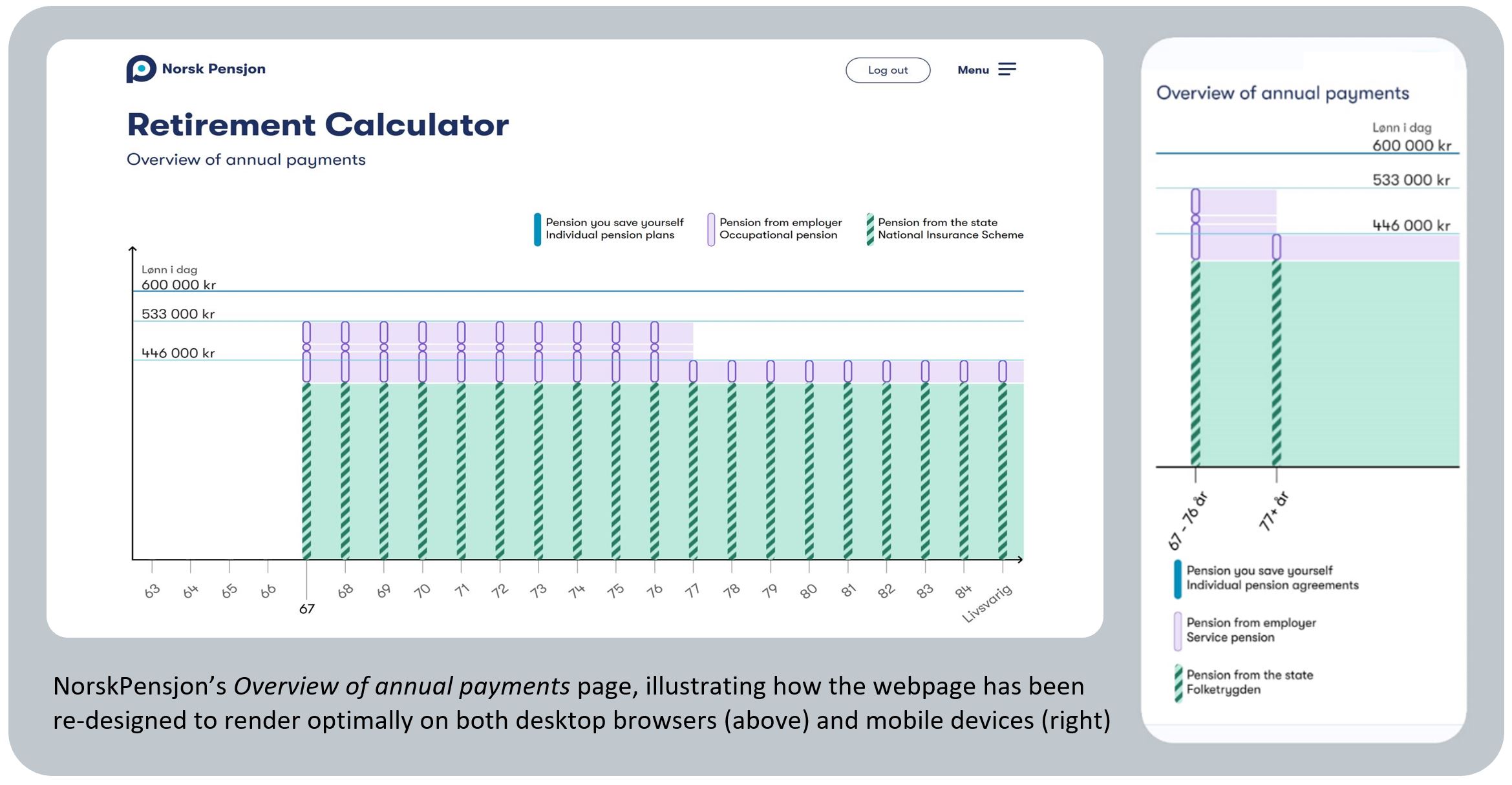
One good example of this is Norway, where the NorskPensjon user interface was relaunched in 2022, rendering differently (and optimally) on both desktop and mobile devices – see example below:
BLANK
So which is the optimal device to design for?
The answer is probably to design for both mobile phones and desktop browsers, as the Norwegian team did in 2022. In very simple terms:
- Type A users (see General Comment 2 above) often access dashboards on their phones, but
- Type B users (as well as Type A users as they become more confident), who want to look at more information, and in more detail, may prefer to access a dashboard on a desktop browser.
It’s obvious really, but the Norwegian example above illustrates well how it’s just not possible to display the same depth of pension information on a small screen as it is on a desktop browser or maybe on a tablet device.
Apps not websites?
Taking this a stage further, because in the UK we are adopting a multi-dashboards policy (see General Comment 8 below), it’s possible that commercial dashboard operators may choose to design their dashboards as apps rather than websites, i.e. hyper-optimised for mobiles.
However, these commercial operators may decide that they also need to host desktop website versions in order to meet the needs of Type B users who really want to see a lot of information in great detail.
Shallow initial UK dataset
In the UK, our initial dataset, as defined in the PDP Data Standards, is relatively “shallow”, i.e. only a relatively limited set of information about each pension is returned by data providers for dashboards to display (but definitely enough to meet Type A users’ basic needs).
So maybe starting with a “mobile first” design principle could make sense, because there won’t be a huge amount of data to display. Then, once dashboards have been launched and the dataset is deepened (as it undoubtedly will be), maybe dashboard operators could move more towards more detailed desktop browser-based webpage designs. Clearly, it will be for each dashboard operator to define their short, medium and long-term device strategies.
BLANK
BLANK
General Comment 5 – Verifying digital identities
Different digital identity services
A critical first step in the user journey for all pensions dashboards is verifying the user’s digital identity, to ensure the user is who they say they are, thus mitigating against fraudulent use of a dashboard.
(Or, on second and subsequent visits, authenticating their identity – for example, via two-factor authentication, or 2FA – because the user has already verified their identity on their first visit.)
National digital identity services are country-specific, so this is a good example of General Comment 3 above, where there’s little point covering here all the detail of these country-specific services.
Other countries’ digital identity service regimes are what they are, and the UK’s will be what it will be, i.e. there are no design choices to be made here by UK dashboard operators as they will all be required to use the same central identity service.
So what are we doing in the UK?
For UK dashboards, the Pensions Dashboards Programme (PDP) has procured a two-year interim central digital identity provider (Digidentity) to support test phases from 1 February 2022 to 31 January 2024.
However, the UK Government (led by DSIT) is bringing forward a new UK Digital Identity and Attributes Trust framework (“the UK DIAT framework”) enabling a range of providers to supply digital identity services.
PDP has said its intention is to deliver a central identity service under the governance and controls regime provided by the UK DIAT framework, once that framework is available.
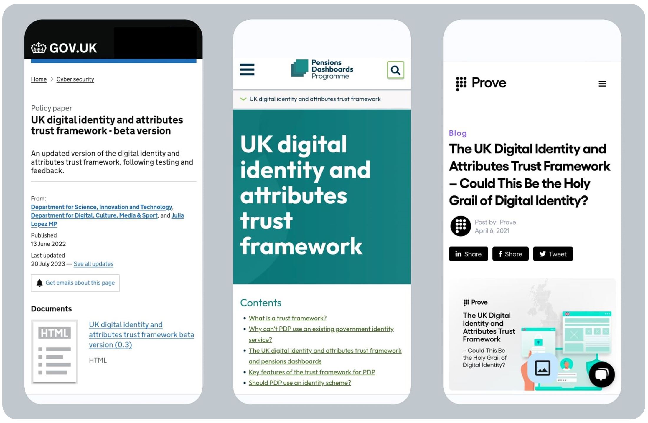
If you’d like to read some further background, a blog article in April 2021 from a top 30 digital identity provider called Prove suggested that the UK DIAT framework could be “the holy grail of digital identity”.
BLANK
BLANK
General Comment 6 – Matching people to pensions
Different ways of achieving matching
Just as different countries have different digital identity services (see General Comment 5 above), so they also have different mechanisms for matching users’ verified identities to the pensions they hold.
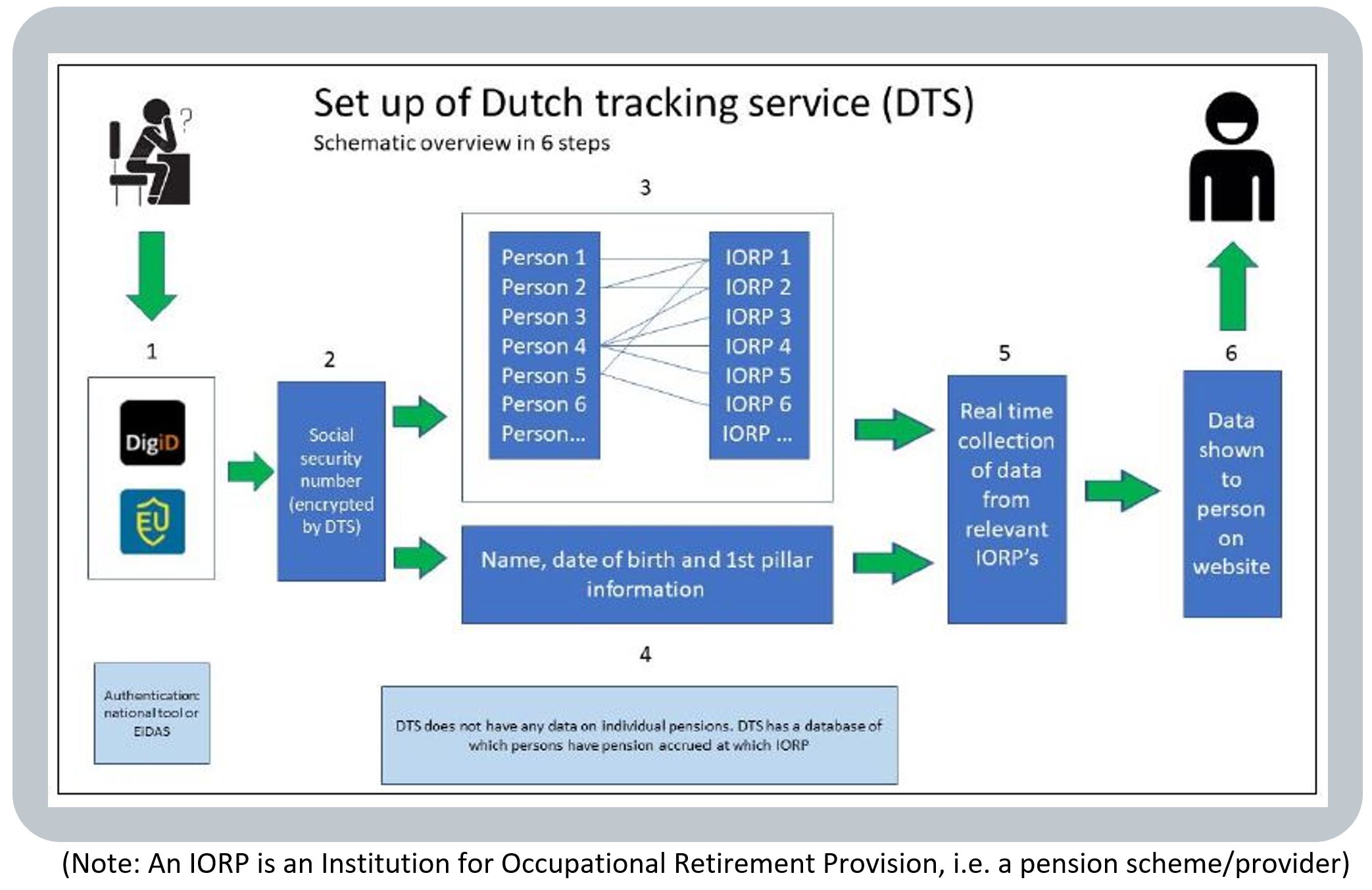
For example, in the Netherlands, Denmark and Norway, a secure central repository is maintained with a record of where each citizen has pensions (but not the actual pension information – that’s retrieved when a user accesses the dashboard). For example, this repository is represented by Box 3 in the Dutch schematic below:
BLANK
Relevance of data matching lessons for the UK?
Because countries take different approaches to how they match dashboard users with their pensions, the experiences of matching in these other countries may not be highly relevant for the UK. The UK’s approach isn’t highly analogous with the matching regimes in any of the five different countries I visited.
So what are we doing in the UK?
Here in the UK, in a message called a Find Request a dashboard user’s verified identity attributes (together with any self-asserted attributes they input, such as their NINO or previous Last Name) are passed to all pension schemes and providers who are compelled to connect to the dashboards ecosystem (i.e. all schemes / providers except very small ones with less than 100 member / policyholders).
Then there’s a legal duty on every scheme and provider to decide how they will determine if they hold a pension for that user. In other words, schemes and providers must decide on the “match criteria” they are going to use to compare the user’s personal details in a Find Request against the pension records they hold.
This is a complex topic, so the Pensions Administration Standards Association (PASA) published detailed Data Matching Convention Guidance in December 2021 (updated in August 2022), with a separate DMC Addendum published in March 2023 giving additional support for pension schemes and providers.
BLANK
Personal data matching research
At least two firms have researched at scale how well the PASA DMC Guidance might work in practice:
- PensionFusion found schemes may need a matching policy comprising multiple match criteria, and
- LCP found matching could be greatly improved if schemes improve their personal data quality.
BLANK
Revisiting continental matching approaches during testing?
Matching is an absolutely critical element that must work for dashboards success: dashboards aren’t going to be much use to you if they can’t display your pensions because your pensions can’t be correctly located.
The UK’s matching regime (i.e. Find Requests coming from the central ecosystem, and the statutory requirement on each scheme to decide their own match criteria) is now settled in law. But we know from the PensionFusion and LCP large scale research that matching could prove problematical.
We need to move to large scale testing of matching as soon as possible, i.e. once dashboards and data providers are connected to the central ecosystem.
When we see how well matching is working, it may be appropriate to revisit some matching lessons from the continental dashboard teams, but only to the extent it’s relevant to do so given the different regimes.
BLANK
BLANK
General Comment 7 – Impartially displaying pensions
Which aspects of a pensions dashboard’s display are truly impartial?
Retrieving a consumers’ gross pension incomes, which have been projected forward on industry-standard or scheme rules bases, and then displaying that data in a neutral fashion, does not involve any judgement.
But as soon as you go further than this, some judgement or partiality is involved.
For example, consider these three seemingly straightforward user questions:
- Gross versus net: “You’re showing my estimated total gross income but what is it net (after tax)?”
BLANK - Income adequacy: “Will the estimated total income shown be enough for me to live on?”
BLANK - Alternative forecasts: “How might my total income change if I retired later or other alternatives?”
BLANK
How do the different dashboards address these types of user question?
Users might reasonably think the above three example questions are relatively straightforward.
But answering them isn’t. And the different dashboards I visited have not all landed in the same place on whether, let alone how, a dashboard should even try to address these questions.
For example:
- Tax? – gross versus net:
– in NO, gross incomes are shown with a warning all amounts are before tax
– the DK dashboard shows which incomes are taxable, but not net amounts
– in SE, there’s an optional net projection feature (for users close to retirement)
– the BE dashboard shows Pillar 1 monthly income both net and gross (Brut), but Pillar 2 monthly income is only shown gross, and
– the NL dashboard shows net total income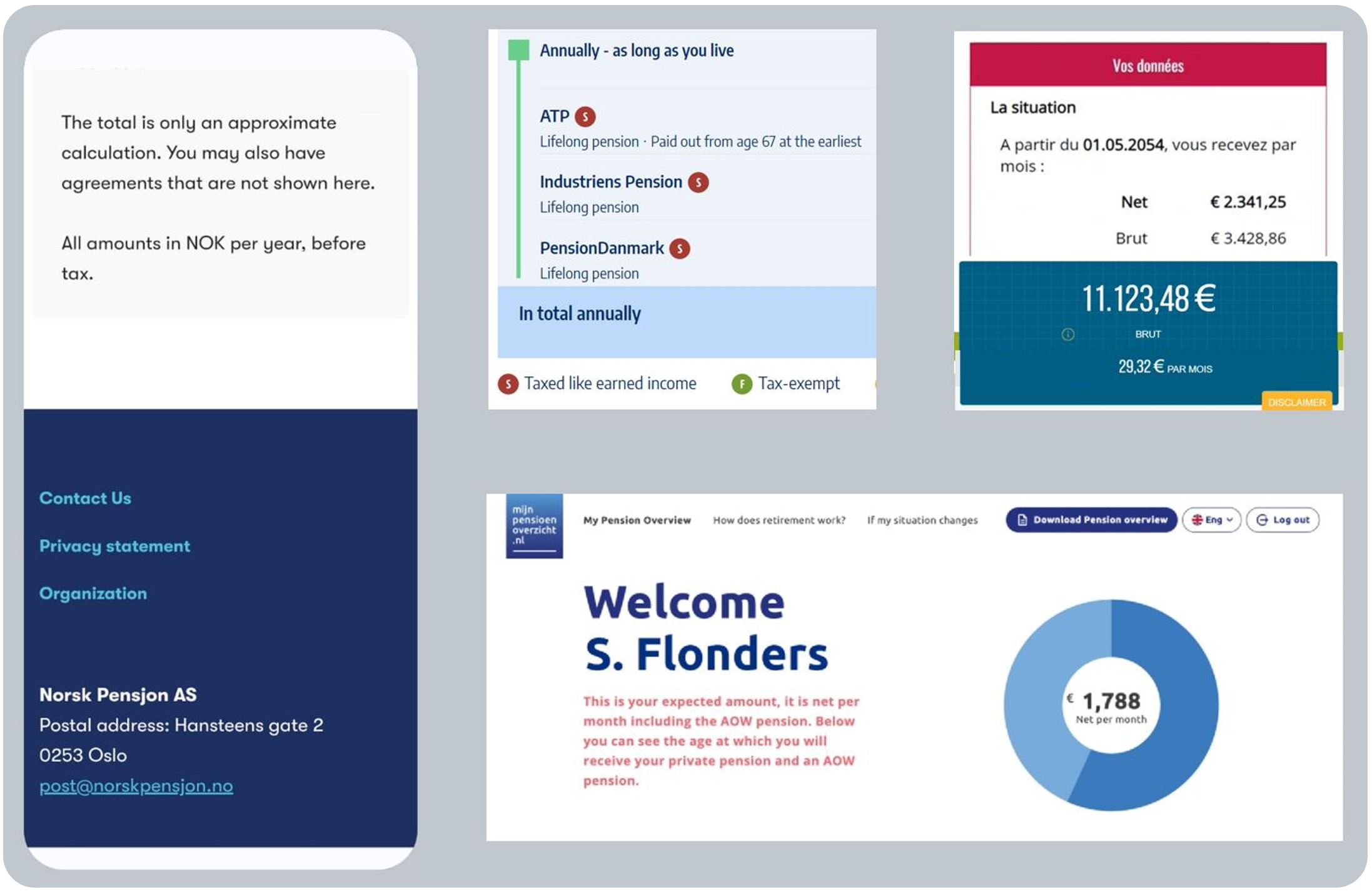
BLANK
- Enough? – income adequacy:
– the Swedish dashboard explicitly shows your salary today (Lön) (in pink) as a comparator to what your pension income might be (in blue), whilst the Dutch dashboard explicitly says: “That [pension] is €x less than what you earn now”
– the Norwegian dashboard asks users to input their salary today (Lønn i dag) as a comparator, and the Danish dashboard gives users an option to compare with present salary if they want to
– the Belgian dashboard doesn’t offer a “Will my pension be enough?” comparator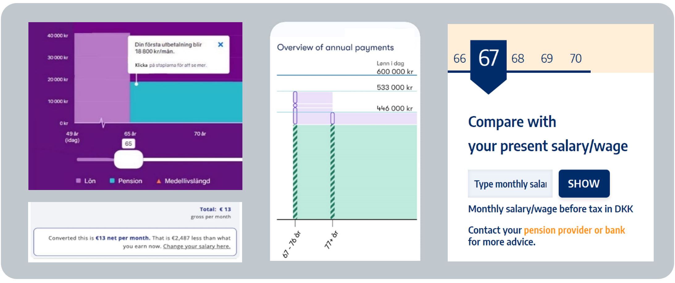
Also, thinking longer term about income adequacy throughout retirement, not just at the start, the Danish, Norwegian and Swedish dashboards all show a “retirement timeline” to help users start to think about their pension income needing to be “enough” for many years into their future old age
(Also see General Comment 10 below for a description of how the Danish dashboard will soon go even further and graphically represent the impact of inflation over the user’s whole retirement)
By contrast, the Belgian and Dutch dashboards show the monthly pension income figure at retirement only, rather than a timeline through the user’s 70s, 80s and 90s
BLANK
BLANK - Alternatives? – different forecasts:
– in DK, pension providers send the dashboard multiple forecasts at different ages, i.e. at age 61, 62, 63, etc. up to age 70, which the dashboard then merely adds up
– the BE, NO and SE dashboards include various Pension Forecasting tools
– the NL dashboard doesn’t offer alternative forecasts: for these, users must contact their different pension schemes and providers
BLANK
Why do these “judgement” features offered by dashboards differ between countries?
It turns out, as we can see from the above, the only truly impartial part of a dashboard is the Find and View service, i.e. a neutral display of solely the pension information returned by pension schemes and providers.
Going any further than this (like deducting tax, or indicating whether the pension income might be enough to live on in retirement, or offering pension forecasts at different ages) involves some judgement, and the different dashboard operators in the different countries have taken different judgements on these points.
Who decides how to exercise judgment on what to show?
The key thing to understand here is who the dashboard operator is, and how they decide what to show:
- Belgium: Government body for Pillar 1, and a Government-funded non-profit body for Pillar 2
- Netherlands: an independent foundation formed by the NL equivalents of UK’s DWP, PLSA and ABI
- Sweden: an industry-owned company, 50/50 joint-funded by Government and the industry
- Denmark: an independent association of pension providers, run by the equivalent of the UK ABI
- Norway: an industry non-profit founded by seven providers in the pensions and insurance industry
BLANK
The Working Committees and Governing Boards of these various different entities in the different countries review just how far their dashboards should go in terms of offering users features over and above a mere neutral “Find and View” service.
The arguments they’ve considered are not straightforward, for example:
- Gross versus net: Users are very interested in what their net total pension income might be, but how appropriate is it for dashboards to calculate tax where users’ wider tax affairs aren’t known?
- Income adequacy: Users want to know if their total pension will be enough to live on, but how appropriate is it for dashboards to opine on this where users’ wider circumstances aren’t known?
- Alternative forecasts: Users want to explore options, such as retiring earlier or later, but the complexities of different pensions can make such calculations highly challenging for a dashboard.
It’s therefore not surprising that the bodies which control the dashboards in the different countries have landed in different places. In the UK, we’re taking a rather different approach to what dashboards can do.
BLANK
How is the UK controlling dashboards’ impartiality and judgement?
In the UK, Government policy is to enable multiple pensions dashboards, i.e. there will be a Government dashboard (from the MoneyHelper service) and then a number of commercial pensions dashboards.
Commercial dashboards are defined in legislation as Qualifying Pensions Dashboard Services (QPDSs). It’s anticipated QPDS will be operated by organisations such as banks, pension providers, and others. The impartiality and appropriate judgement of QPDSs will be controlled as follows:
- Impartiality: The impartiality of the core “Find and View” element will be controlled by Design Standards specified by the Money and Pensions Service (MaPS) Pensions Dashboards Programme (PDP). All QPDSs must comply with these standards, and the MoneyHelper dashboard will largely comply with these Design Standards too.
- Judgement: For subsequent user journey elements, where judgment is required (like net pension, income adequacy, alternative forecasts, and so on), the Financial Conduct Authority (FCA) is allowing QPDS providers to offer “Post View Services” (PVSs). But PVSs must be defined, user tested, and notified to the FCA in firms’ applications to become authorised to operate a QPDS.
BLANK
How else will the impartiality and judgment of QPDSs be controlled?
Three different bodies control what QPDSs can show and what features they can offer users:
- FCA: Because provision of a QPDS will be an FCA regulated activity, QPDSs (and their associated PVSs) are also covered by the new FCA Consumer Duty (CD). Amongst other things, CD requires that QPDSs (and PVSs) must be thoroughly tested with a variety of consumers before firms can launch and operate them. This user testing must focus on consumers’ understanding of the pension information they’re seeing on the QPDS, as well as associated mandatory warnings about the information (for example, that all pension income amounts are estimates and not guaranteed).
- PDP: In addition, the PDP Design Standards require QPDSs to be clear, comprehensible, neutral, logical, inclusive, accessible and user-tested. QPDSs must present the pension information as it is returned by pension schemes and providers – QPDSs are not permitted to amend the data, including not undertaking any calculations, except totalling. Graphical displays are permitted (for example, like those in Denmark, Norway and Sweden), but these graphics must be preceded by appropriate explanations and, like all aspects of QPDSs, must be user-tested for understandability.
- DWP: Finally, DWP’s Pensions Dashboards Regulation 13 requires QPDS operators to commission an independent expert auditor to carry out an audit to confirm their QPDS complies with all PDP and other Standards. This audit must be done both prior to launch and every year after launch.
So even though the UK policy is a little different to other countries’ in enabling multiple commercial pensions dashboards (QPDSs), there are numerous controls on the impartiality of QPDSs and the judgements allowed in the extra features QPDSs may offer (in the form of regulated Post View Services).
BLANK
BLANK
General Comment 8 – Making data available to apps
Making pensions data available to be viewed on a central dashboard and more widely
In all five countries I visited, there is a central dashboard where users can see their pensions together.
But some of the countries also make the retrieved pensions data available to be viewed on other digital services, or apps. Denmark does this, and, to a limited extent, so does Sweden (i.e. to just a couple of external organisations and just the default projection data). The Netherlands is reviewing its plans on this.
But Norway is the country where making data available to other apps is perhaps most advanced. NorskPensjon.no was established in 2008. Then since 2015, after the central service had been running for seven years, the NorskPensjon-retrieved pension data has been made available to be viewed on other apps, via Application Programming Interface (API) technology. Chief Executive Trond Tørstad said in Oslo:
“Every time people check their bank account on their banking app, they can request to see their pensions there too – we now get about 3 million requests a month”.
[Note this is the total number of requests rather than unique users – for context, the Norwegian working age population is roughly 3.5 million.]
BLANK
What is the UK position?
Of course, in the UK, our “Day 1” model is to have both the Government’s MoneyHelper dashboard and a number of FCA-regulated commercial dashboards – or Qualifying Pensions Dashboard Services (QPDSs). The Norwegian usage data above is potentially very illuminating in terms of which of the many different UK pensions dashboards people may choose to use, and their frequency of use of those dashboards.
BLANK
BLANK
General Comment 9 – Understanding what users feel and do afterwards
How do dashboard users feel after seeing their pensions on a dashboard?
The different dashboard teams receive various anecdotal feedback from users, for example:
- “I like the language – it explains things without too many difficult words”
- “Simple overview that gives a good overview of my pensions”
- “Easy to find out what I might get in retirement pension”
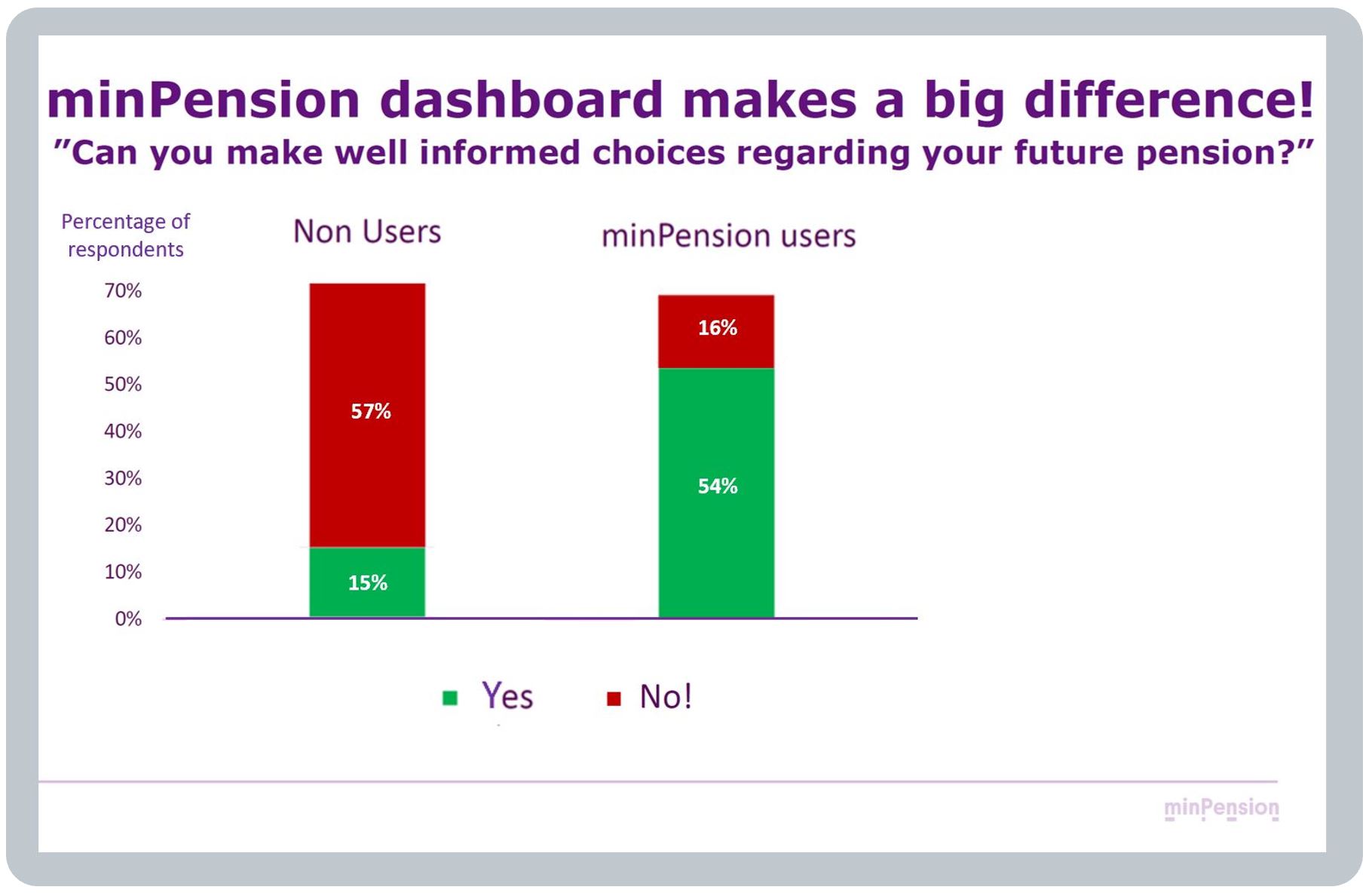
The Swedish dashboard team has also surveyed users, and non-users, to understand the extent to which minPension has helped users (see example graph below). The team is broadening this research, working with an academic research partner, to better understand the impacts of their dashboard, reporting from 2024 onwards.
BLANK
What do users do after using a dashboard?
Nothing: Some users, typically Type A (see General Comment 2 above), are content merely to see their estimated total pension income on a dashboard and then log off without taking any action at all.
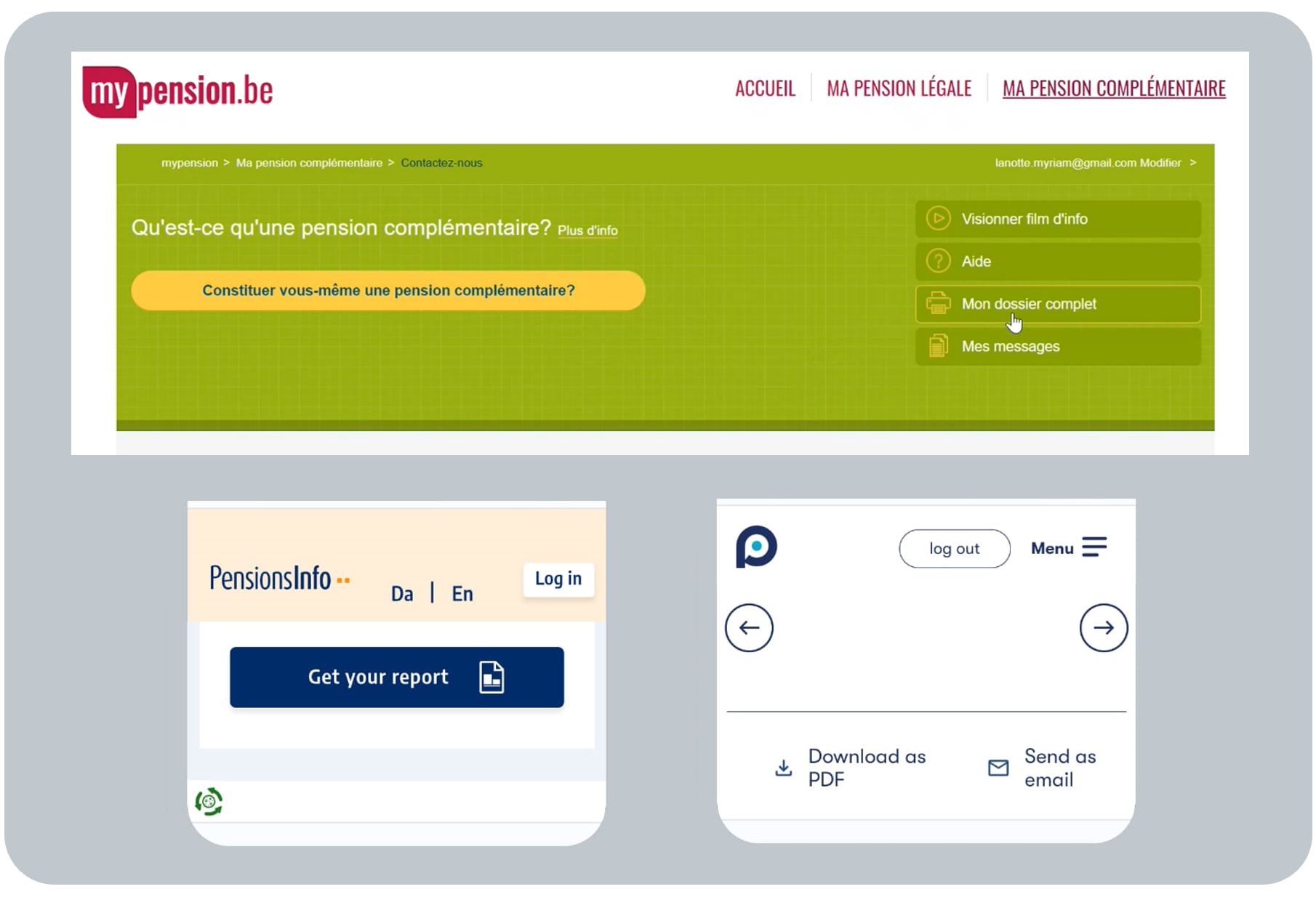
Print / Export: Other users want a record of the pension information they have found and viewed on a dashboard, so dashboards typically offer a “data export to pdf” button, or similar, e.g. print / export “My complete file” (“Mon dossier complet”) on the Belgian dashboard. These download features are well used.
Consumers use these data exports / printouts to support subsequent conversations, e.g. with pensions advisers. In Sweden, for example, 95% of pension advisers refer to minPension data when discussing retirement planning with their clients.
Downloads are also used as part of the evidence financial institutions require for other financial products, such as mortgage applications – a major motivation for younger people to use dashboards in some countries.
Different pension forecasts: Users (typically older / Type B) also make good use of the alternative forecast tools some dashboards offer, for example to see how their pension might change if they retired earlier or later.
Making changes: However, the extent to which users actually make changes (such as increasing their pension contributions, consolidating some of their pensions, and so on) is not explicitly visible to the continental dashboard teams. This is because the continental dashboards deliberately limit their scope to offering to an impartial “Find and View” service (see the debate under General Comment 7 above). Rather, the dashboards seek to empower users, enabling them to make more informed, better choices, elsewhere.
BLANK
What does this mean for the UK?
The evidence is very clear that pensions dashboards help many users become more aware of their total pension position and grow their pensions confidence over time. This is particularly true for Type A users.
We can also learn that many users will want to do nothing afterwards; whilst some will want to download their data; and others will want to use modelling tools (which could potentially be achieved in the UK via a data export followed by a Post View Service (PVS) which automatically pre-populates a pension modelling tool).
But the UK’s regime of FCA-regulated commercial dashboards (QPDSs), with associated PVSs, is a different model to the continental dashboards. So it isn’t possible to draw strong conclusions about what actual actions users might take after using a QPDS (as QPDSs with PVSs don’t exist at scale in other countries).
The one country which is partially UK-analogous is Norway, where banking apps can show the centrally retrieved pensions data (see General Comment 8 above). However, Norway already has a policy of automatic pensions consolidation (similar to the current small pots policy development in the UK) – so we can’t learn how many people might consolidate pensions from these apps, as it happens automatically.
BLANK
BLANK
General Comment 10 – Launching, and continually improving, dashboards
No substitute for experience
The dashboards of the five teams I visited have been running for many, many years. Next year, in 2024, the Danish dashboard will have been operational for 25 years, the Swedish dashboard 20 years, Norwegian 16 years, Belgian 14 years, and the Dutch one 13 years. So that’s 88 years of operational experience in total!
BLANK
Test / Launch & Learn / Enhance
But you can’t get experience unless you launch something.
A key message, which came across loud and clear from all the teams, was that the only way to truly and deeply learn how to deliver a sophisticated pensions dashboard User eXperience (UX), which meets different users’ needs really well, is to test your dashboard with a variety of consumers, launch it, see how different types of users react, learn what needs to change, and then start making continual improvements.
Here is some more detail on these critical lessons around testing, launching & learning, and enhancing dashboards:
- Testing:
A key lesson here is that, prior to launch, dashboards should be tested extensively with:
a) a variety of user types viewing
b) their real pensions data.
a) Variety of user types: The overwhelming majority of every working age population are Type A users (See General Comment 2 above). But at launch, the keenest users are likely to be Type B. So if the initial focus has been mainly on meeting Type A users’ needs, i.e. showing summary basic pensions information, then Type B users may be disappointed if initial dashboards don’t meet their more sophisticated needs and expectations.
Expectation management amongst potential Type B users is essential (see the insightful quote below from Anders Lundström who runs the Swedish dashboard).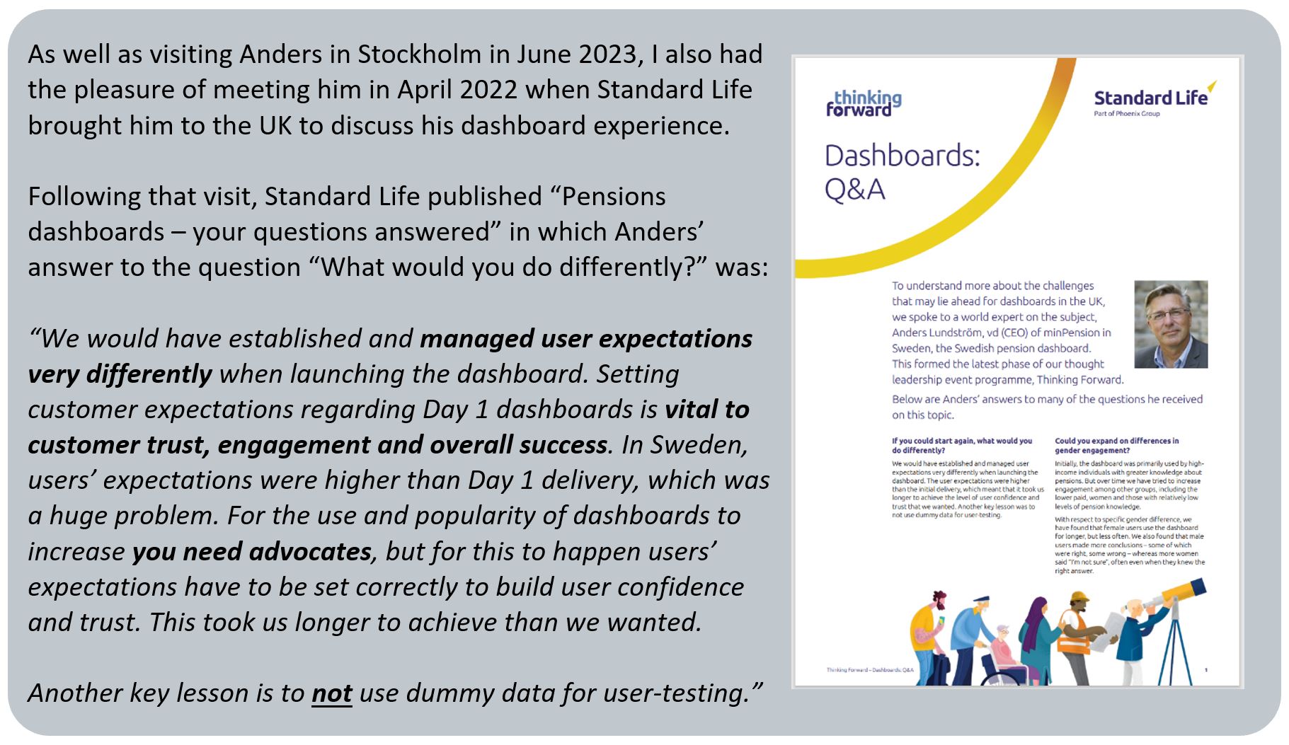
b) Real pensions data: Anders also said to me in Stockholm:
“It’s crucial to test features with users’ real pensions data as it engages a different part of the brain: seeing generic data is intellectual, but seeing your own pensions data is emotional and triggers a completely different reaction”.
BLANK - Launching & learning:
In Copenhagen, Michael Rasch’s strong advice was to:
“Start small, launch an early version, learn, iterate – do not try and launch everything at once”.
Crucially, whilst this means accepting that some user needs won’t be met at launch, it enables functionality to be launched and tested for real.
In Stockholm, the Swedish team conduct ongoing real-life testing of how minPension is used to continually improve its functionality, working with psychologists and researchers. One thing this has shown is that, generally, older users prefer assimilating dashboard information via words and numbers, while younger people often engage more with graphs and other visual representations.
The Swedish team have put a lot of effort into improving their user interface, to offer multi-channel options, and making minPension simpler and more intuitive to use, with different information layers (helping to meet the needs of both Type A and Type B users across their nine-segment model – see General Comment 2 above). This has resulted in far better user engagement with their dashboard.
BLANK
- Enhancing:
One of the most inspiring things I witnessed when visiting the five dashboard teams, was their excitement to continually make their dashboards even better, despite them already having been live for many years. All the teams have such enthusiasm to continually improve their dashboards and meet different types of users’ needs ever better. As at summer 2023, three examples of exciting upcoming changes, informed by user insight and demand in different countries, are:
BLANK
Netherlands – broadening access: Stefan Taubert and team in The Hague have big plans to keep enhancing the Dutch dashboard. Stefan said:
“We keep enhancing it: for example launching consent-based data sharing with providers and modernising the platform to support increased demand”
Making data available to other websites and apps will broaden Dutch access in the same way Norway has done (see General Comment 8 above), with potentially huge impacts. In the UK, of course, with commercial dashboards, this is our policy position from Day 1.
BLANK
Denmark – illustrating inflation: PensionsInfo’s highly developed pension timeline has been incrementally improved over many years based on considerable user feedback: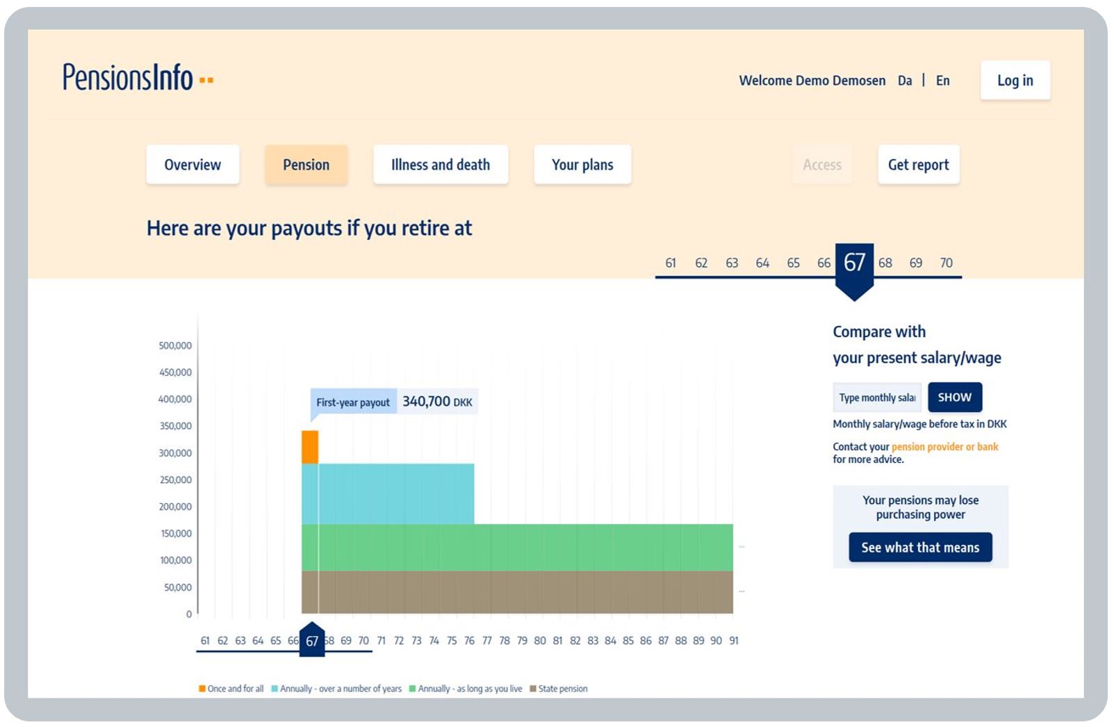
Because it shows many retirement years of annual pension incomes (going through until age 90 and beyond), there’s a button at the bottom right which brings up an explanation of inflation over time: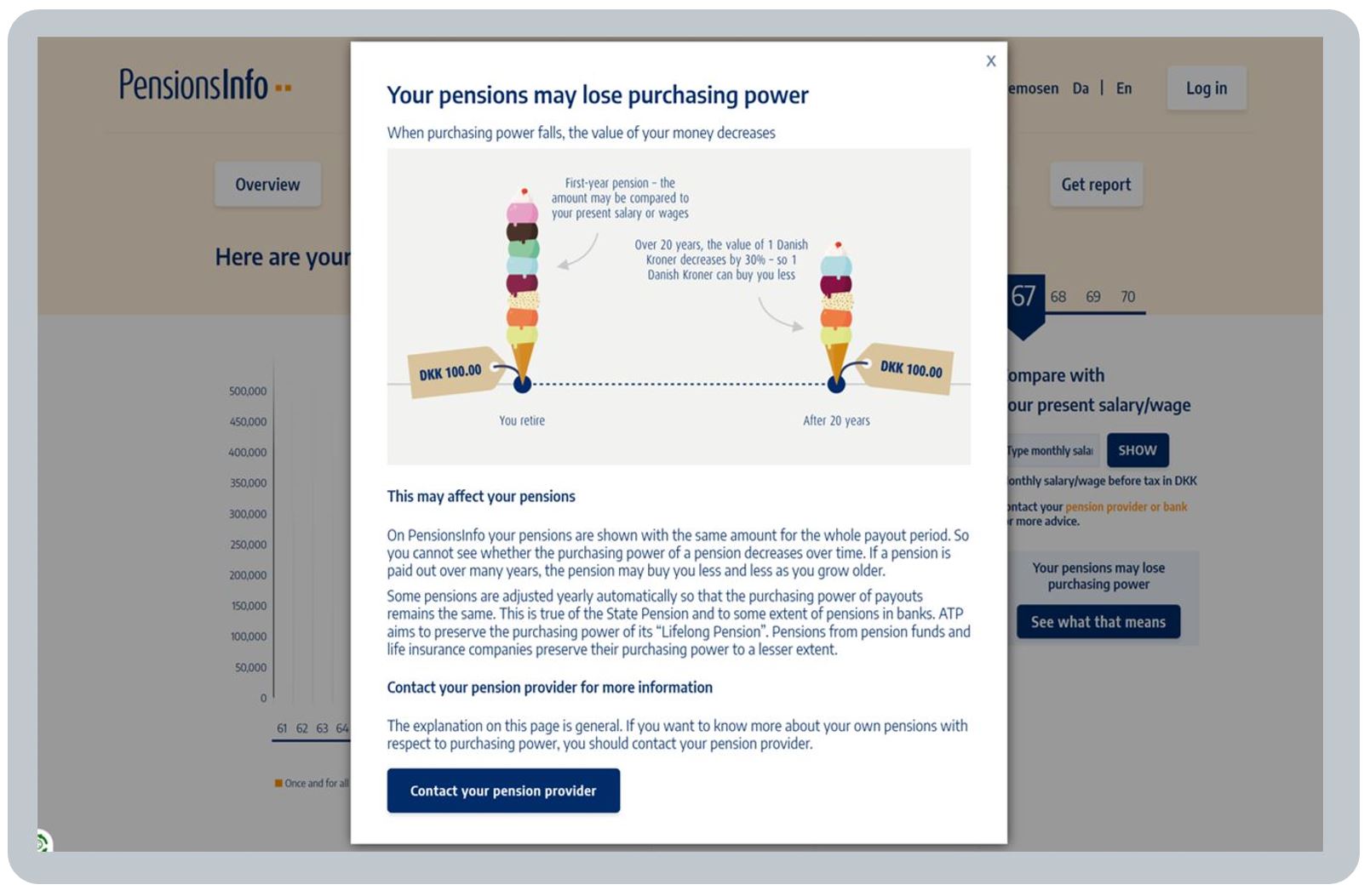
But that’s a lot of words for a user to read and understand, plus it relies on the user clicking the “See what that means” button under the statement Your pensions may lose purchasing power.
So in the latest iteration of the timeline, being launched in Autumn 2023, those pensions which aren’t inflation-proofed are shown actually decreasing over time (see the blue pension in the example below) to represent any flat pensions’ reduced spending power in real terms over time: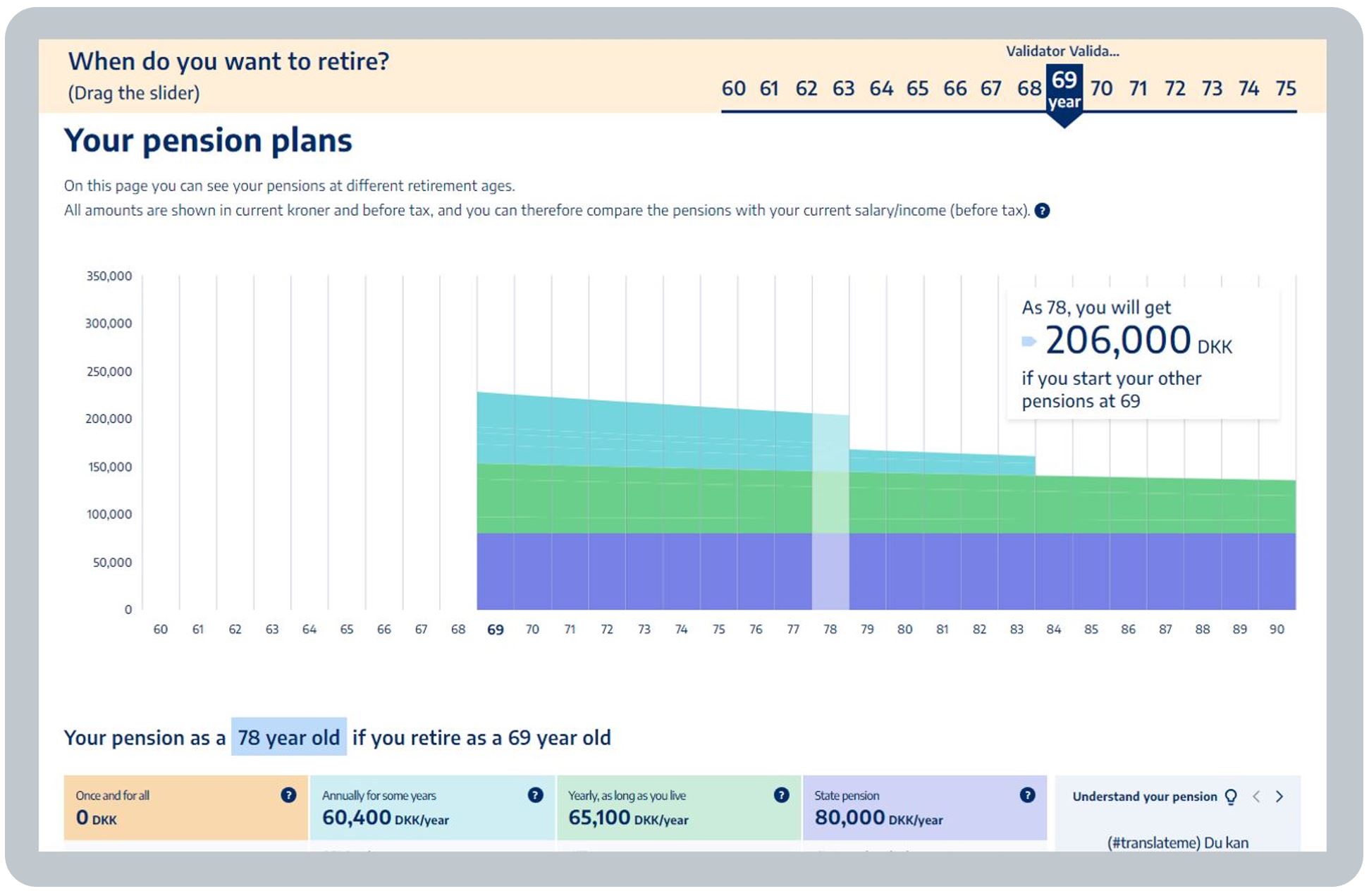
BLANK
Sweden – addressing climate impacts: Finally, I asked Anders what users of minPension most say they would like the Swedish dashboard to do which it currently doesn’t do. His immediate response:
“Show the Environment, Social & Governance credentials of each of their pensions, such as the climate impacts of each pension’s underlying investments”
I found it incredibly exciting that Swedes are actively asking to see this – surely a great way to people interested in pensions! (see my own Climate change page).
Anders had mentioned this in London in 2022. He said: “We are undertaking a study to include more ESG information on the dashboard. Conceptions of ESG are changing and vary between different countries, but we are working hard to ensure our ESG information will be relevant and up-to-date. At the same time, we know from user testing that most users will only spend up to three minutes assimilating information on ESG, so this information must be effectively delivered”.
Summary
Great pensions dashboards are achieved by making many improvements, over many years, and those improvements never stop; but to start making those improvements, you first have to launch version 1.
BLANK
BLANK
Page content verified in September 2023 by the teams who operate mypension.be, PensionsInfo.dk, minPension.se, NorskPensjon.no and Mijnpensioenoverzicht.nl. Huge thanks to you all. Cheers, Richard Smith.