Introduction
A good way to think about ideas for dashboards is to look at some sample mock-ups. These sample dashboards can show what simple features might work best, especially given the underlying complexities of a user’s different pensions.
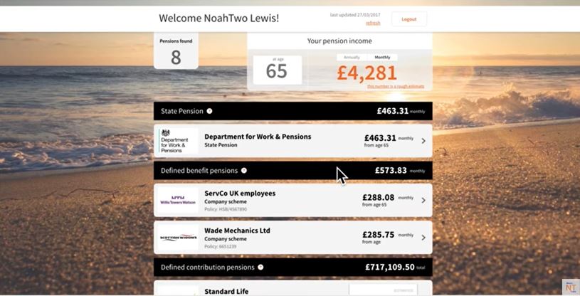
For example, here’s the prototype dashboard from 2017:
Things have moved on a lot in the last four years, though, so I’ve created a dozen sample dashboards to contribute to the ongoing industry-wide debate.
It’s important the information shown on these dashboards is real: not just for credibility, but also to show the range of real-world complexities which need to be handled.
So I’ve used my own defined benefit (DB) and defined contribution (DC) pensions built up over my career from 1987 to date. Watch my January 2021 video case study for details.
The table below links to the dashboards, from simple (Sample001) through to more complex (Sample012). Beneath each dashboard, I’ve discussed aspects that could be tested with users and improved. See the Important Note below as well.
Sample dashboards
| Sample001 | Simple list in alpha order |
| Sample002 | Simple list is start date order |
| Sample003 | User-definable display order |
| Sample004 | Table in start date order |
| Sample005 | Table in last updated date order |
| Sample006 | Table in payable from date order |
| Sample007 | Explaining a pension’s three dates |
| Sample008 | Graphical timeline |
| Sample009 | All pensions as at the present |
| Sample010 | DB accrued or revalued to today |
| Sample011 | DC incomes built up so far |
| Sample012 | Total retirement income built up so far |
Important Note
These dozen Sample dashboards only consider how found pensions could / should be displayed. I have not currently covered any aspects of very the important “upstream” user experience at the moment, for example:
- selecting and logging into my chosen dashboard
- identity verification / authentication
- finding / matching my pensions
- maybe matches
- response times.
These dozen Sample dashboards assume that:
a) my identity has been successfully verified / authenticated,
b) all my pension schemes / providers have been able to successfully match my personal details against the pension records that they hold for me, and
c) they are able to immediately return the required pension information when I request it so it can be displayed on my chosen dashboard.
These “upstream” aspects of the user experience are crucial. For now, though, I am focusing on the “downstream” display aspects as this will contribute to the current debate about what data dashboards should show.