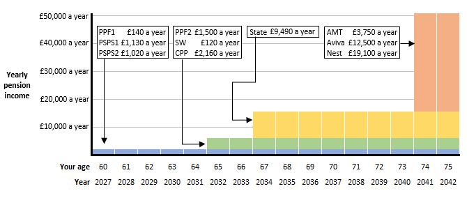
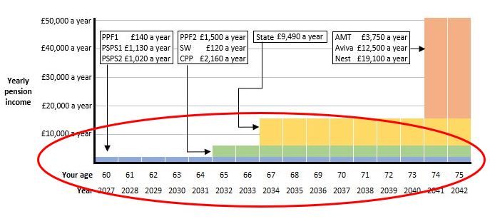
The sample dashboard below (Sample008) shows a timeline of my pensions, assuming they can all be digitally found, depicting the year each will normally be payable from (unless I take them early or late). See Sample006 for the same information in table format.
The user testing done in the other countries which have developed dashboards has led to several of those dashboards having a similar timeline format: users in these other countries have tended to find this the most understandable and helpful way of seeing all their pensions.
This timeline clearly illustrates the dates complexities discussed in Sample007. These complexities are discussed below the dashboard.
Graphical timeline
Sample008
Discussion topics
Will users be able to understand this timeline?
Some users of dashboards might find a graphical timeline like this very easy to understand, but others might be confused by it and prefer a simple table of pensions like Sample006.
Beta testing should thoroughly explore this. The extensive user testing carried out in Sweden when they redesigned the front end of the Swedish dashboard from 2014-17, found the optimal display for Swedish users is to show both a timeline and a table.
Whether or not users will find the format helpful also depends on whether the numbers actually make sense. And there are quite a few problems with this, as discussed below.
What are some of the problems with the numbers shown on this timeline?
1) Out of date deferred DB pensions
First of all, as we’ve seen in the previous Samples (such as Sample005), my two Prudential pensions are out of date – see PSPS1 and PSPS2 in the red circle on the timeline below:
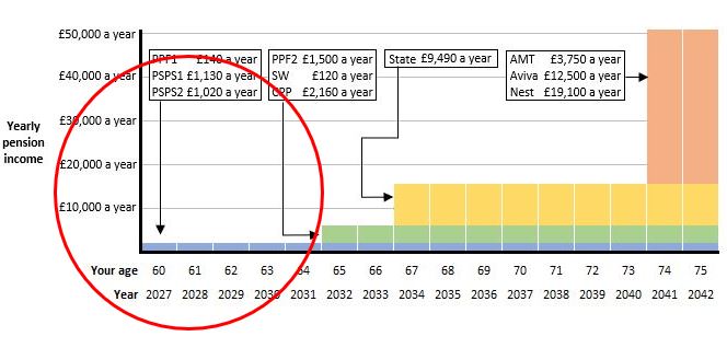
As we’ve seen, the PSPS1 amount shown of £1,130 a year was last updated in 1995, and the PSPS2 amount shown of £1,020 a year was last updated in 1998.
Revalued to 2021, these two amounts would be approximately £2,200 a year and £1,600 a year respectively.
So my two out of date Prudential pensions shown, together totaling £2,150 a year, should actually be about 75% higher than that, at roughly £3,800 a year.
This is a major issue: it not only understates my DB pensions, but it might lead me to pay in more to my active DC pension when I don’t actually need to to reach my target retirement income.
2) DC pension incomes from age 74?
Looking to the right of the timeline, there’s immediately something a bit odd-looking in that my Aon Master Trust (AMT), Aviva and Nest pensions don’t come into payment until I’m 74 in 2041 – see the red circle below:
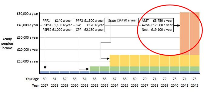
What’s going on here? Well, like the majority of people these days, rather than using these three DC pension pots to buy an annuity, I will draw them down over time.
When I had my Pension Wise appointment I discussed this with the pension guider. One idea that came out of that really helpful discussion was whether, if I’m not going to buy an annuity, I wish the DC pensions’ underlying investments to be automatically switched into less volatile asset classes (which providers normally do in the background in increments over the five or ten years prior to my Selected Retirement Date (SRD)).
Rather, because I want to maximise my DC drawdown pots, I want to remain in growth assets. One simple way to achieve this is to tell my DC pension providers that I won’t be accessing my DC pots until the latest possible moment, i.e. when I’m 74.
So I have changed the SRD held for me by Aon, Aviva and Nest to my 74th birthday. (I haven’t got around to doing this for my smaller Scottish Widows DC pot, where the SRD is still set to the default of age 65, as you can see from the timeline.)
One disadvantage though of setting my SRDs to 74 (so I stay in growth assets), is that the projected pension incomes shown on my annual statements (and probably returned for me to view on a dashboard) are also calculated as starting from age 74. In reality, I will start drawing down these DC pension pots long before this – maybe 15 or more years earlier.
3) DC pension incomes shown are much too big, for multiple reasons
So, my AMT, Aviva and Nest pension incomes shown start much too late, and, as a result, are obviously overstated as well because they are assumed to grow for longer, and be paid out for a shorter time.
But that’s not the only reason my Nest pension income shown is too big (red circle below).
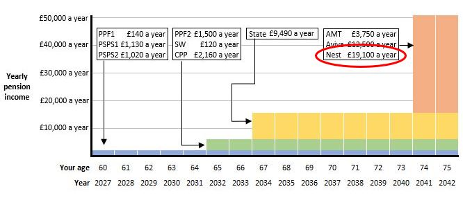
Nest is my currently active DC pension and, as a one-off in 2020 I paid in quite high contributions. The projected pension income shown, however, assumes I will continue making the same high level of contributions every year for the next 20 years!
The pension income I actually receive from Nest will therefore be only a fraction of the £19,100 a year shown.
But what future contributions should Nest have assumed I will pay in? It’s very hard to say.
4) DC pension incomes not the same as each other
The pension incomes shown, derived from my different DC pension arrangements, haven’t been derived on the same bases as each other.
For example, my Aviva pension income (£12,500 a year) is assumed to increase in payment each year in line with the Retail Prices Index (RPI). However, the Nest pension income (£19,100 a year – which we know is far too high anyway) is assumed to increase in payment each year in line with the Consumer Prices Index (CPI), which isn’t the same as the RPI. Both pensions are assumed to continue to a spouse after my death at the rate of 50%.
And here’s further confusion: I took the Aviva £12,500 a year figure from my Aviva annual statement (at 8 July 2021), which is quite likely to be the figure returned for me to view on a dashboard. But if I log into my account on the Aviva website to find out more, it says my pension income could be almost double the dashboard figure, at £24,200 a year!:
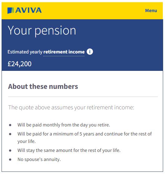
Why is this almost double the £12,500 a year shown on my annual statement / dashboard? It’s because (as set out in the “About these numbers” notes above) the online quotation of £24,200 a year assumes the income:
a) will stay the same, i.e. it won’t increase in payment each year (unlike the statement / dashboard income which was assumed to increase each year in line with the RPI, and
b) will have no spouse’s annuity payable after my death (unlike the statement / dashboard income which did assume a 50% spouse’s annuity).
So this makes me think: which number should be on dashboards? The £12,500 a year which includes increases and spouses, or the much higher £24,200 a year which excludes increases and spouses? Or some other figure based on different assumptions?
It probably varies from individual to individual. For example, as a widower, I don’t need a 50% spouses annuity assumed. (And, as I’ve explained, I won’t even be buying an annuity for myself! – I’ll be doing draw down like nearly everybody else these days.)
Whatever figure we personally think is the right one, we can be sure the different pension providers will have made different assumptions and therefore the different DC pension incomes will not have been calculated on the same bases as each other?
But how many dashboard users do we really think are going to understand these complexities and subtleties between the different incomes they see on a pensions dashboard?
5) Pension increases during payment ignored
While we’re talking about pension increases during payment, we should point out that the timeline completely ignores these.
My DB pensions from Prudential and Centrica, plus my PPF Compensation and my State Pension of course, will increase in payment to keep pace with inflation.
But the blue, green and yellow bars on the time are shown as flat from year to year to year, i.e. not increasing:
This might be OK. In effect, all figures on the timeline as in “today’s money”, i.e. both future inflation and future increases to the pension incomes are being ignored. This might be a reasonable simplification to avoid confusing dashboard users.
But if the DC pension incomes shown are not going to increase (for example if the higher £24,200 a year Aviva pension income is shown), then these are not comparable with the DB pensions which do increase. What should happen in this case is the DC pension income bars should get smaller year on year to illustrate their reduced spending power over time.
6) Only years rather than specific dates shown
One simplification of using the timeline instead of a table is that we have lost the actual dates which are now shown as years.
So, for example, from the timeline it looks like my State Pension of £9,490 a year is payable from 1 January 2034 – the start of the yellow bar below:
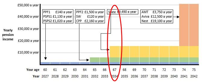
But as we’ve seen, my State Pension Date is 8 August 2034, so I won’t be able to claim my State Pension until eight months into 2034.
This might be an acceptable simplification, but, like everything else about the display, it needs to be thoroughly beta tested with users.
7) No early payment possibility shown
Finally, the timeline starts from when I’m 60, in 2027, because that’s when my earliest “Date payable from” is. But as we’ve seen, it’s possible for me to access any of my pensions from next year (2022) when I turn 55 (the current normal minimum pension age (NMPA), increasing to 57 from April 2028).
Of course, the pension incomes payable from earlier dates would be lower than those shown here. When this happens, DB pensions have “less than 100%” early retirement factors (ERFs) applied which reduce them to take account of having to be paid for longer. And for DC pensions, the pot of money won’t have had so long to build up, so will likely be smaller when money starts being taken out.
Will dashboard users realise that the pension incomes could be paid earlier than the dates shown, but that they will be smaller? It would be incredibly complex, and probably not doable, to show the lower amounts payable from earlier dates.
Users’ thoughts and feelings about this whole of topic of early payment, and how it should be flagged on dashboards, needs to be thoroughly beta tested.
So how do we resolve all (or at least some of) these problems?
The discussions in Sample009 onwards look at possible ideas to help mitigate most of these problems. In summary, for simplicity, and because users don’t really understand past and future dates, I think all pension amounts shown on dashboards should be “as at now”.