Introduction
The Swedish pensions dashboard is minPension.se.
On 15 June 2023, I had the absolute privilege of visiting the minPension team in Stockholm on the middle stop of my Pensions REDUX tour.
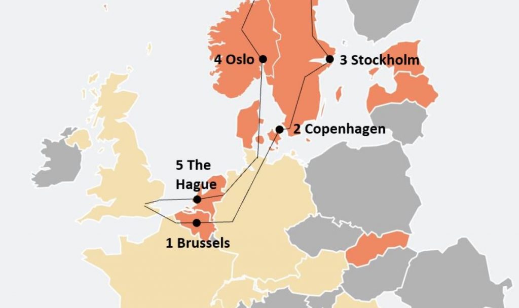
The core purpose of the tour was to learn more about mature pensions dashboards’ user experiences (UXs) and user interfaces (UIs).
So the main findings below focus on the high-level UX and UI before, whilst, and after using minPension.
The Swedish team were also very generous providing me with other insights, such as usage statistics, so I’ve included some of these findings below too.
Before reading on, for context please do have a look at the Background and 10 General Comments page.
After reading the findings below, feel free to get in touch with me if you’d like to talk about dashboards, discuss the findings, and what they might mean for forthcoming pensions dashboards in the UK.
What’s on this page?
Other information about minPension
UX before using minPension
minPension is an online service well-known to Swedes.
The service is available via:
- minpension.se
- direct login (single sign-on) from other organisations’ websites
- application programming interface (API) from the Swedish Government online service.
minPension is now very widely used. Pension providers and advisers promote the brand. Employers, like Volvo, also promote minPension to all their new employees. And various offline initiatives promote the service to the digitally excluded section of Swedish society.
MinPension is very deliberately positioned as an independent service, neither Government nor industry, but a collaboration between the two. It is run by a separate entity half funded by both Government and by industry (see Other information about minPension below).
In fact, the overall design style, such as the distinctive purple background and colourful building blocks, were user tested as part of the latest UX redesign to help with that messaging around independence:
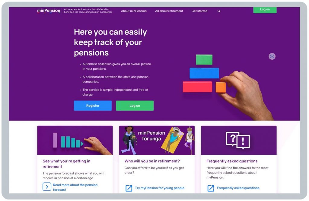
As I mentioned in my LinkedIn post, immediately after visiting Chief Executive Anders Lundström and Senior UX Designer Johan Svensson in Stockholm, Anders said:
“In testing with users, we found the purple background, and the coloured blocks, helped users understand we’re independent, neither Government nor industry, and it helped ease their anxiety about pensions too.”
Arriving at the minPension.se homepage, users’ expectations are immediately set, in very simple and clear terms, by positioning what the minPension service is:
- collaborating between the Swedish Government and pension companies; therefore independent
- collecting pension data automatically from pension providers to show your overall pensions picture
- costing nothing to you the user, providing you with a simple service, with a focus on ease of use.
What can you see before logging in?
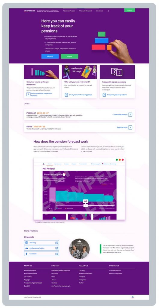
Before logging in, a user has access via the homepage to a frankly vast array of really useful content all about retirement and about minPension. There’s also a dedicated section for unga (young people).
Amongst other things, there’s a blog, a Dictionary, FAQs, a Handbook, a YouTube channel, a Podcast, as well as explanations of minPension’s core Pension Forecast, Earned Pension and Withdrawal Planner tools.
I can’t really do justice to all this content here – if you’re interested, just click the links above and have a good look around (your browser should be able to automatically translate most of the different content).
Much of this multi-channel content has been developed in response to the user segmentation exercise in 2015 (see Usage of minPension below and General Comment 2 about segmenting users by needs).
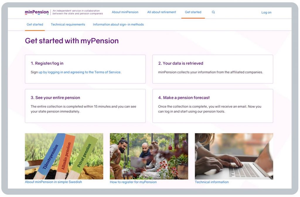
As you can see above, the Get started with minPension page summarises what will happen when a user logs in, again helping to set users’ expectations:
- your pension data will be collected from your different pension providers, taking up to 15 minutes (State Pension is available to be viewed immediately)
BLANK - you’ll receive an email confirming when the data collection is complete, after which
BLANK - you can see your entire pension, and start using the various minPension tools, such as Pension Forecast.
BLANK
The homepage invites users to log in, giving them options to use different digital identities:
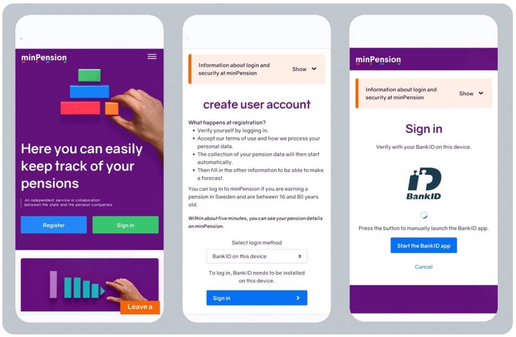
As explained in General Comment 5, there’s not much point covering Sweden’s digital identity services in any detail here – they are what they are, and the UK’s identity service will be what it will be, i.e. there are no design choices to be made here by UK dashboard operators as they will all be required to use the same central identity service.
Pension data is then collected from different pension providers, taking up to 15 minutes, although in reality it is much quicker, and the user is sent an email confirming when the data collection is complete.
BLANK
UX whilst using minPension
After the user has logged in to minPension, and minPension has collected the user’s pension data from the user’s different pension providers, the landing or Overview (“Översikt”) page displays this simple Pension Forecast (“Pensionsprognos”):
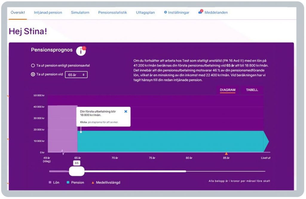
Anders and Johan pointed out to me at least nine specific design features on this Overview page which are explicitly derived from extensive user testing designed to quickly build confidence, trust and understanding:
- top menu sequence: the order of the menu options along the screen top is designed to reflect users’ top questions, in the order they tend to ask them:
BLANK
What total pension income might I get? – Overview (Översikt)
What have I got so far? / Is it complete? – Pension earned to date (Intjänad pension)
What could I get at different ages? – Simulator (Simulatorn)
How do I compare to people like me? – Pension statistics (Pensionsstatistik)
How can I get my pension? – Withdrawal planner (Uttagsplan)
BLANK - language and colour tone: minPension greets the user by name (Hi Stina!) to help them understand the service is both secure and of relevance to them. And, as mentioned above, the colour palette has been deliberately designed to help reduce anxiety about pensions generally
BLANK - retirement timeline: running from the user’s 60s to their 80s and beyond, helping the user understand immediately that their retirement could last quite a long time (retirement is a journey)
BLANKBLANK - table option: however, user testing found some (typically older) users prefer to consume numbers in tabular rather than diagrammatic form, so there’s a table toggle option on the right
BLANK - first monthly pension income payout amount: the key figure most users want to know is what total monthly income (TMI) they might get when they retire, so this is clearly highlighted in a white box, with the option to click on the coloured bars for more details (for Stina, the text explains that if she continues to earn her current salary of 41,200 Krona a month until she is 65, she might get 18,800 Krona a month at 65 – at current exchange rates that’s about £1,370 a month, or roughly £16,400 a year)
BLANK - tax position: a bottom right note explains all monthly Krona amounts shown are before tax
BLANK - income adequacy: to help users begin to understand if their total pension income will be enough to live on during retirement, the pension income (in blue) is placed alongside the user’s salary (Lön) (in pink) which they earn at their current age today (idag) – this is also explained in words. In Stina’s example shown above, the timeline starts at her current age (49), with her estimated 18,800 Krona a month pension at 65 being 46% of her current 41,200 Krona a month salary at 49 (representing a reduction in income of 22,400 Krona a month)
BLANK - retirement duration: the timeline is designed to help users understand retirement is a journey, but it will end, so to help users understand that too, a red triangle on the timeline shows Stina her average life expectancy (Medellivslängd): of course, she may live longer than this, or die sooner, but placing life expectancy right on the landing page helps to get users thinking about this question
BLANK - alternative retirement forecasts: a drop-down box at the top, and a slider on the timeline, both allow the user to see how their pension income figures might change if they retire earlier or later.
I think you’ll agree this is a really well developed, and user tested, landing page display for a dashboard.
BLANK
How do I compare?
Once users have seen their estimated TMI (total monthly income) on the Overview page, a very popular feature is for them to see “How does this total pension compare to other Swedes like me?” (which is answered on the Pension statistics page):
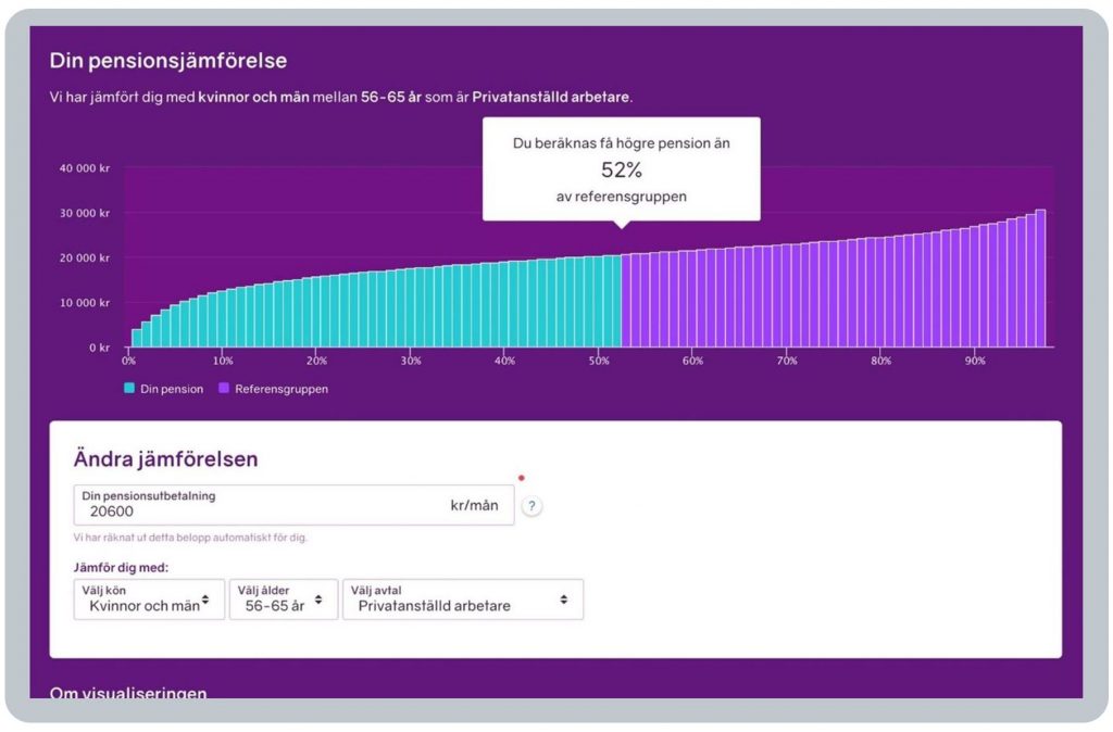
This graph is very powerfully showing this example user is that, compared to their peer group (of employed workers who are aged 56 to 65), their pension income is higher than that of 52% of the reference group.
Or in other words, their pension is pretty much the average total pension income for Swedes like them.
There are drop-down boxes beneath the graph allowing the user to alter the peer reference group, for example selecting different genders, age groups or employment statuses.
You can see why this is a very popular feature, can’t you!
Of course, in the UK, any sort of comparison like this to other savers would have to be a Post View Service (PVS) as this is well beyond the core Find and View function. And indeed, this sort of comparison may not even be possible anyway depending on controls on data sharing. But it is really powerful, isn’t it?
BLANK
Three other main functions
There is a great deal of other functionality on minPension.se, which has been extensively tested with users for understandability. Below are summaries of the main three other pages / functions, with more details available on the minPension website itself:
- Earned pension
- Pension Simulator and
- Withdrawal planner .
BLANK
Earned pension page (summary only)
For a fuller description go to https://www.minpension.se/allt-om-pensioner/pensionsprognos/se-din-intjanade-pension (your browser can translate it).
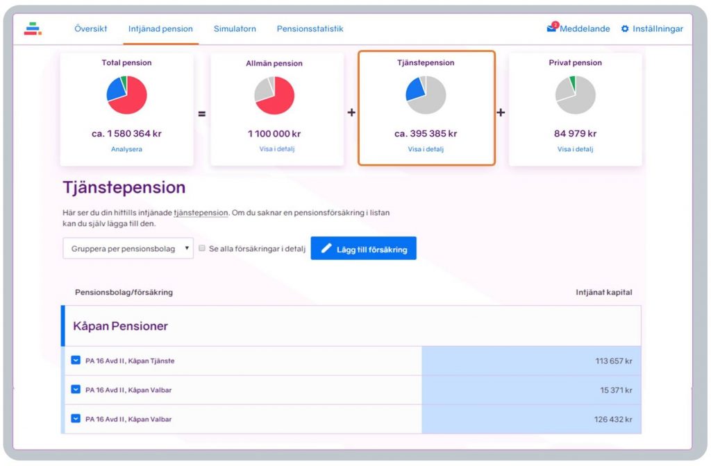
The “Earned pension” page shows pensions built up to date, across state (Allmän, in red), workplace (Tjänste, blue) and personal (Privat, green) pensions. Clicking on each segment of the pie chart lets the user delve deeper into those pensions and read about them (blue has been clicked on in this example):
BLANK
Pension forecast / Simulator page (summary only)
For a fuller description go to https://www.minpension.se/allt-om-pensioner/pensionsprognos/se-vad-du-far-i-pension (your browser can translate it).
MinPension offers two pension forecasting tools:
- Pension forecast, on the Overview page which, as explained above, gives users a quick picture of their future pension, letting them see how retiring at different ages affects their pension income
BLANK - Simulator, a more detailed forecasting tool, enabling users to simulate what might happen if they were to make various changes such as changing jobs, earning more, withdrawing different pensions at different times, changing investments, etc. Before and after tax figures are shown. A “wizard” tool helps the user with default and other choices and users can create up to 99 different scenarios.
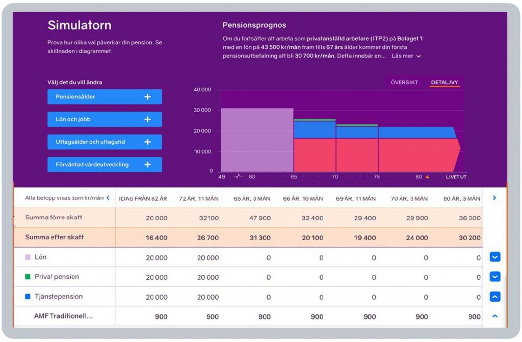
Of course, in the UK, any type of alternative pension forecasting would have to be a Post View Service (PVS) as this is well beyond the core Find and View function which is not permitted to carry out any calculations except adding up the estimated retirement incomes (ERIs) returned by pension providers.
BLANK
Withdrawal planner page (summary only)
For a fuller description go to https://www.minpension.se/allt-om-pensioner/ta-ut-pension/uttagsplaneraren-pa-minpension (your browser can translate it).
minPension’s Withdrawal planner (Uttagsplaneraren) helps older savers (from age 54) to think about how they might actually take their pension payments in retirement. The closer a user is to retirement, the more certain the pension forecast is, so users are told to only use this feature when thinking about withdrawing pensions.
The development of the Withdrawal planner is still ongoing, between pension providers and minPension, with the development broken down into phases so the UX will improve over time. This is a great example of how, even though minPension is 20 years old in 2024, enhancements and improvements continue.
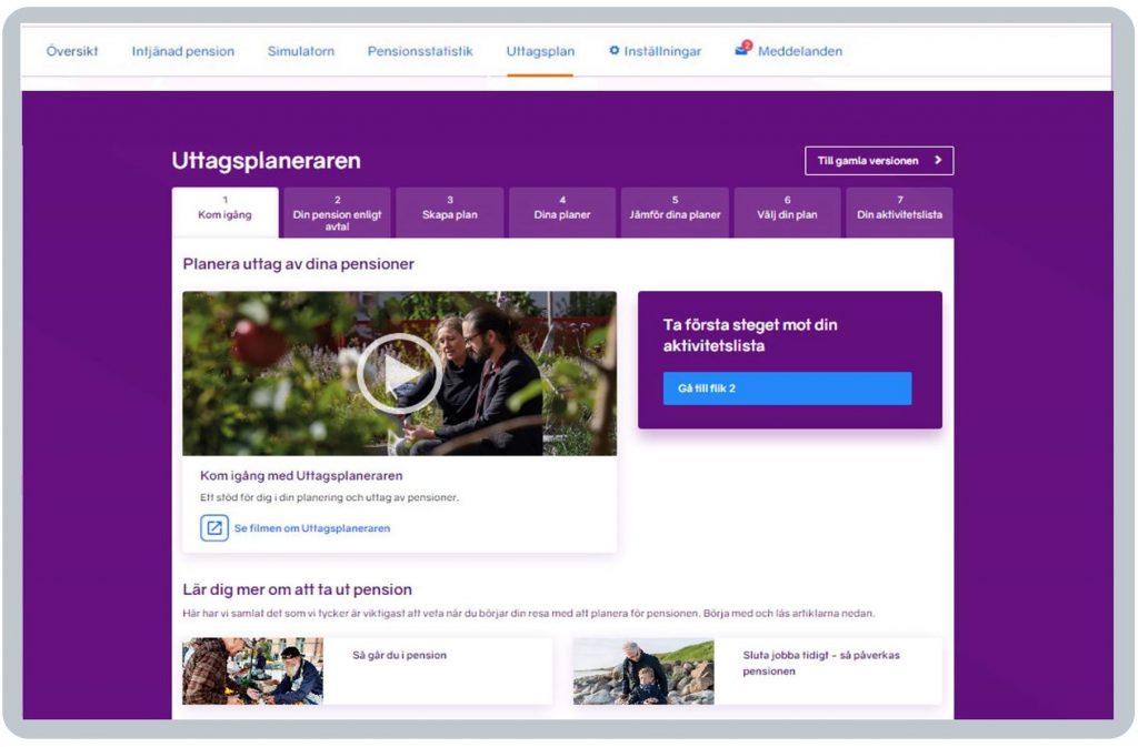
The planner helps older users see:
- how different withdrawal options would affect their future finances
- what impact the tax has on their pension
- the difference in withdrawing pensions at different times
- comparisons between different pension plans and how they differ
- a checklist to support them in the further process of withdrawing their pensions.
Users are instructed to contact their pension providers (including the State Pension provider) before making any decisions about their withdrawals. In time, the plan is to move to digital execution of retirement plans.
Of course, in the UK, any type of service helping savers take money from their pensions would have to be a Post View Service (PVS) as this is well beyond the core Find and View function.
BLANK
UX after using minPension
Many users’ core interest in their overall pension position can be boiled down to three simple questions:
- What have I got?
- Is it enough for me to live on in retirement?
- What can I do?
BLANK
What have I got?
In Sweden, the initial focus of minPension is to help Swedes answer question 1, in terms of both:
- a forecast total pension income at different potential retirement ages, and
- current defined contribution savings.
minPension also allows users to create a “To do” list of actions should they wish to take next steps.
BLANK
Is it enough?
In terms of the second question above (“Is it enough?”), minPension displays the forecast pension income against the user’s salary to give an idea how their future income might compare to what they earn today.
BLANK
What can I do?
On the third question above (“What can I do?”), minPension is focused on being impartial, so it enables citizens to use tools to consider this more subjective question themselves, having built their confidence.
For example, after using minPension, Swedish citizens may take steps to:
- understand in more detail what pension income they may need in retirement
- learn more about pensions generally to give wider context
- speak with their pension providers, or an adviser, or others who can help
- take appropriate steps if they wish, including using the Simulator and Withdrawal Planner tools.
See UX before using minPension above for links to the very large amount of really helpful content on minPension to get users started with this onward pensions learning and understanding.
BLANK
Taking action
As discussed in General Comment 7, the extent to which users actually make changes to their pension position after using minPension.se is not explicitly visible to the minPension.se team.
This is because PensionsInfo deliberately focuses on offering an impartial “Find and View” service which primarily seeks to empower consumers, helping them to be better informed, so they are able to make better decisions. There may be more visibility over time, e.g. as usage of the Withdrawal Planner deepens.
So do people actually feel more empowered to make more informed pension choices as a result of using minPension? What does the minPension team know about how people feel afterwards? The results below are really encouraging.
BLANK
How do Swedish dashboard users feel after using minPension?
The minPension team has surveyed users, and non-users, to understand the extent to which minPension has helped them (see example graph below). This shows the proportion of people who feel they can make well informed choices about their pension nearly quadruples from the green 15% (before using minPension) to the green 54% (after using minPension):
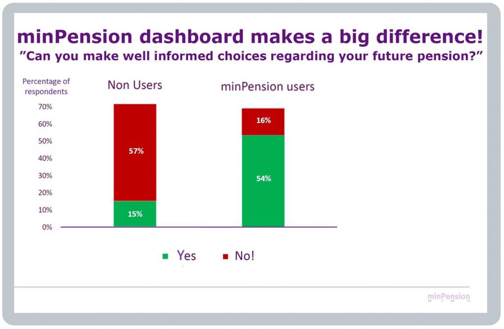
The team is broadening this research, working with an academic research partner, to better understand the impacts of their dashboard, reporting from 2024 onwards.
BLANK
Usage of minPension
Each quarter (kvartal) on the minPension blog, the Swedish dashboard team publish usage statistics (användarstatistik). At the time of writing, the latest quarter available is Q2 (April to June) 2023:
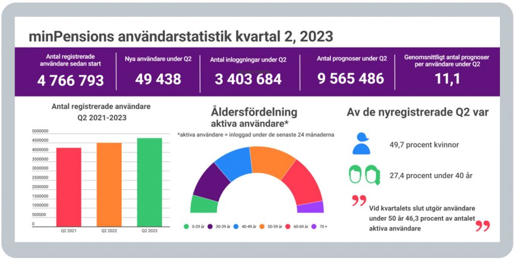
These statistics above shows that:
- 8 million users have registered to use minPension since it was launched, with
BLANK - just under 50,000 new users registering in Q2 2023, of which
BLANK - 49.7% were women (kvinnor) (overall, though, more males than females are active users with a 53% male / 47% female split)
BLANK
The semi-circle pie chart shows that:
BLANK - 46% of active users are under age 50 (green, purple and blue segments) and
BLANK - 54% of active users are aged 50 or older (orange, red and purple segments)
BLANK - There were 4 million logins during Q2 2023, with
BLANK - 6 million pension forecasts being run, with these users running about 11 forecasts each on average (but as explained in UX whilst using minPension above, in the UK, any forecasts like this will need to be Post View Services (PVSs), i.e. outside the scope of the core Find and View consumer journey).
BLANK
Annual usage
The total number of unique users in 2022 was about 2.5m who logged in a total of 15.7m times in the year i.e. 7.0m (Q1) + 2.9m (Q2) + 2.6m (Q3) + 3.2m (Q4).
So, on average, the 2.5m active users logged in just over six times each during 2022.
In Sweden, there are about 6.5 million working age adults (covering the five decades from people in their 20s through to people in their 60s).
So, ignoring the very small number of users aged 70 and over, the 2.5m unique users in 2022 represent roughly 38% of the working age population (i.e. 2.5m ÷ 6.5m).
But higher proportions of Swedes use minPension going up through the different age bands:
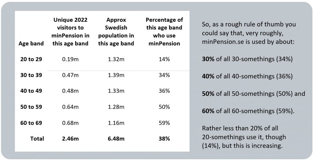
The above statistics, with relatively high usage at younger ages, reflect the Swedish dashboard team’s hard work over recent years to make minPension as relevant and useful as possible for younger age bands.
There is a spike in usage in February / March following the issuance of the “orange envelope” to all Swedish citizens, and also following public and provider media stories on pensions which can come at any time.
BLANK
Different types of user
Since 2015, the team have put a lot of effort into improving the user interface, offering multi-channel options, and making the service simpler and more intuitive to use, with different layers of information.
For more details on this, see UX before using minPension above, and also General Comment 2 and General Comment 10 which discuss the importance of segmenting dashboard users by their different user needs, and then testing that these different user needs are being met, testing with real pensions data.
BLANK
Different device usage
Users tend to use mobile devices to access the minPension.se website when they are just doing a quick check on their pensions. When they’re thinking about their pensions in more detail, they tend to what to look at minPension.se on a laptop / desktop browser.
BLANK
Other information about minPension
The core purpose of my research tour in June 2023 was to learn more about mature pensions dashboards’ user experiences (UXs) and user interfaces (UIs). However, the Swedish team were also very generous providing me with various other insights about the Swedish dashboard, which I’ve summarised below.
This “Other information” section covers some summary points on the:
- history of minPension
- governance of minPension
- vision for minPension.
BLANK
History of minPension
minPension started in 2004 and is the result of a collaboration between the Swedish Government and the insurance industry, to address questions related to pensions information.
When Chief Executive Anders Lundström visited the UK in April 2022, and took part in a Standard Life webinar on dashboards, he gave an overview of the main phases of minPension’s over the last 20 years.
This included a major reworking of minPension’s user interface (UI) in 2014/15 so that it would feel more relevant and useful to all segments of the Swedish working age population. This has led to the content-rich and very highly user tested UI described in the UX before and UX whilst using minPension sections above.
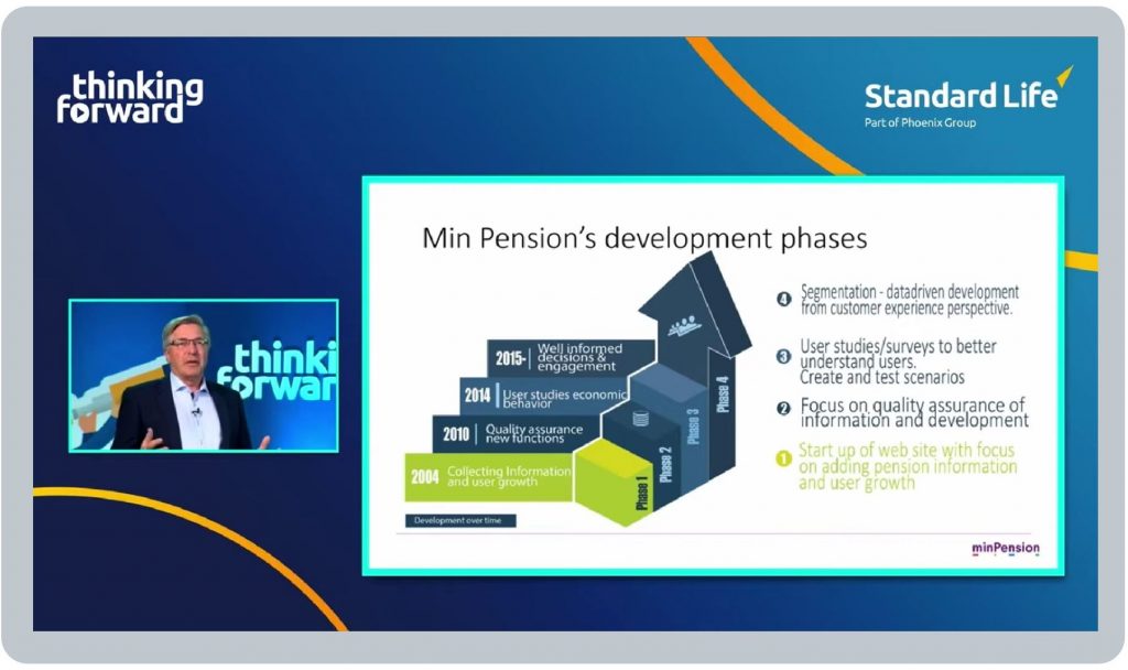
A core focus of this UI redesign since 2015 has been moving from a dashboard that informs users about their pensions to one which helps users understand their pensions, with well user tested designs and layered information to support that understanding amongst users of different types (see General Comment 2).
The ambition has been, by humbly listening to detailed user feedback, across different types of users, to design a service which grows users’ understanding and confidence, to trigger a behaviour of engagement.
BLANK
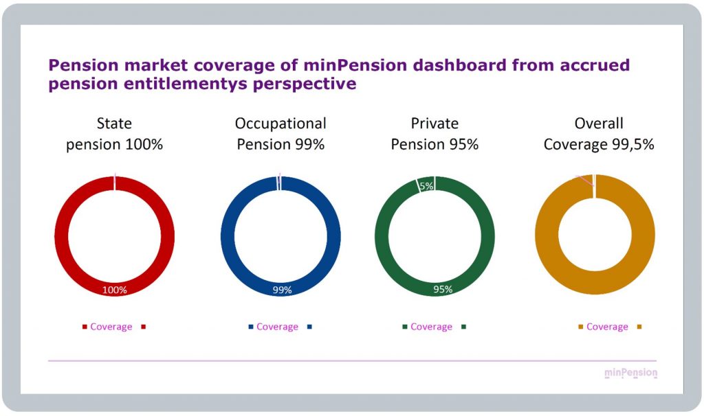
Coverage of pensions has grown over the years to today when there is virtually universal coverage:
BLANK
Governance of minPension
There’s a lot of information about minPension (i.e. the organisation as opposed to the dashboard) on the About page of minpension.se.
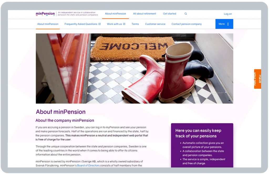
In particular, there’s an excellent summary brochure “This is minPension”, extracts from which are below.
minPension is owned and operated by the not-for-profit company minPension i Sverige AB, which is a wholly owned subsidiary of Svensk Försäkring (Insurance Sweden), the industry organisation for insurance and pension companies in Sweden.
Cooperation between Government and industry on minPension is regulated by a consortium agreement.
Half of the company’s Board of Directors are from the Government, and half from pension companies.
minPension had 18 employees as at the end of 2022.
BLANK
Funding
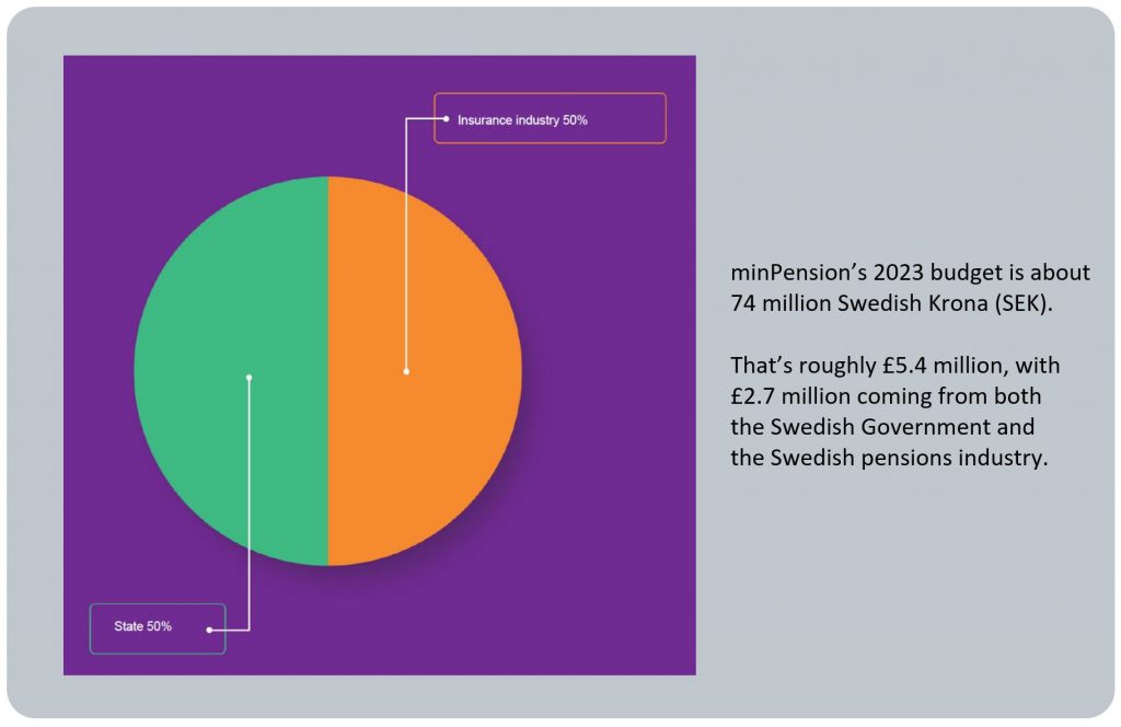
The minPension consortium agreement prescribes that the dashboard’s operation and development must be exactly joint funded by Government and industry:
BLANK
Vision for minPension
minPension has been, and will continue to be, continually enhanced to serve Swedish citizens ever better.
Put simply minPension’s vision is “to offer the best independent services so that everyone can easily make informed choices about their entire pension and receive good support for withdrawing their pensions”.
The “This is minPension” brochure mentioned above sets out a number of goals (mål), from different stakeholder perspectives, one being to achieve 5 million registered users (användare) by Quarter 4 of 2023:
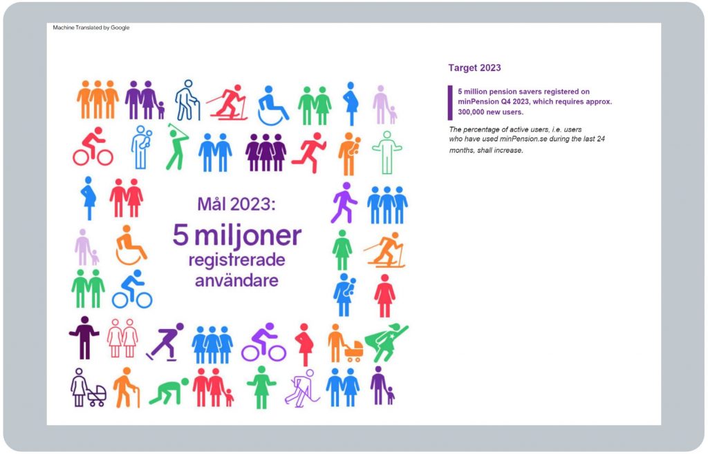
Other goals for 2023, and into the longer term, include:
- 65% of the 5 million registered users having logged in during the previous 24 months (increasing to 70% of 5.5 million registered users in the longer term)
BLANK - 65% of users feeling they have control over their pension (increasing to 80% in the longer term)
BLANK - 55% of retired people having used MinPension’s Withdrawal Planner tool (80% in longer term).
So even though, over nearly 20 years, minPension has now become a highly sophisticated service for Swedish citizens, it is still being continually developed.
One example of this, in response to strong user demand, is minPension’s aim to show Environment, Social and Governance (ESG) information about users’ pensions. See General Comment 10 for more details.
BLANK
BLANK
Page content verified by the minPension.se team on 20 September 2023